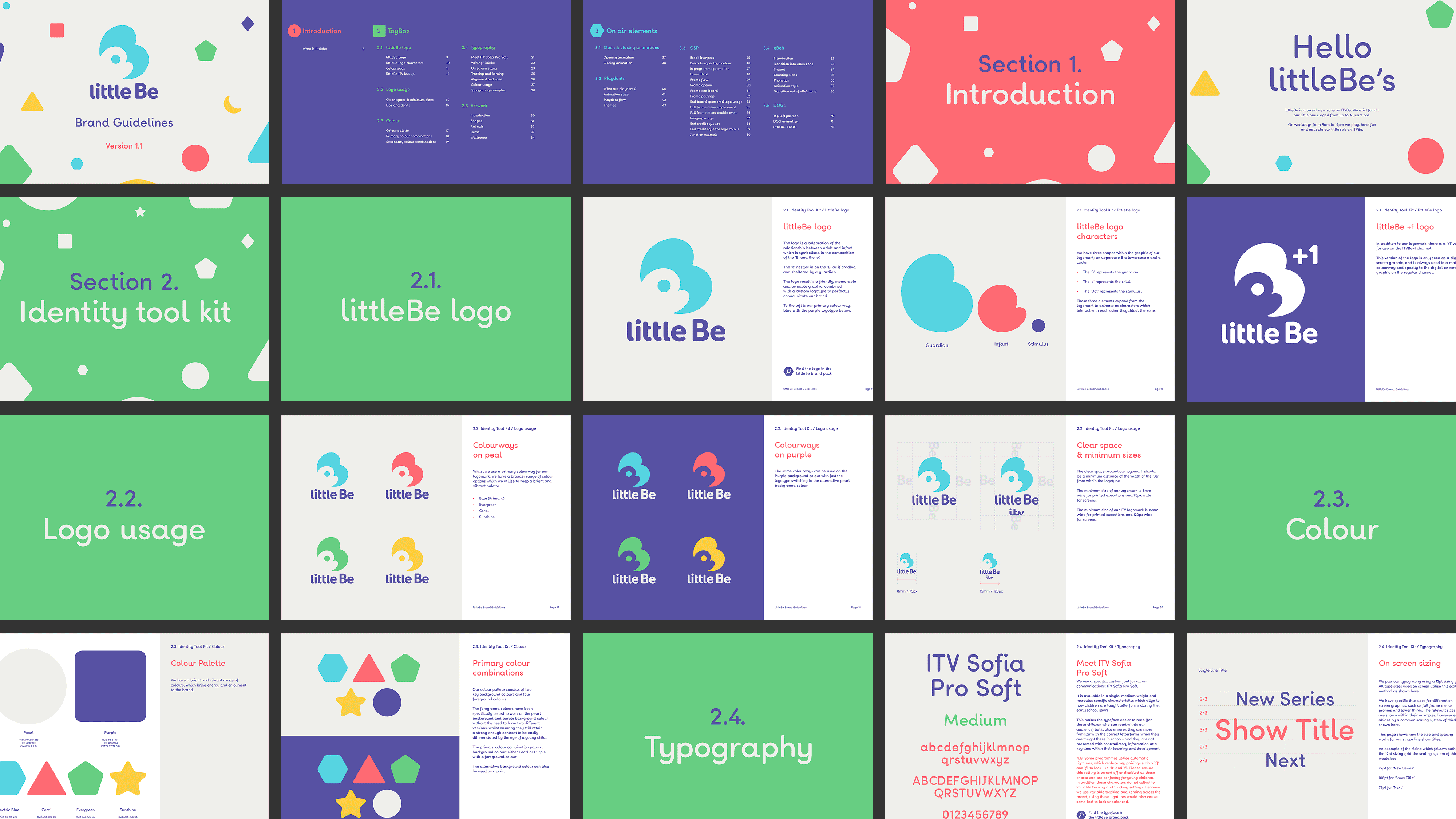
BRIEF.
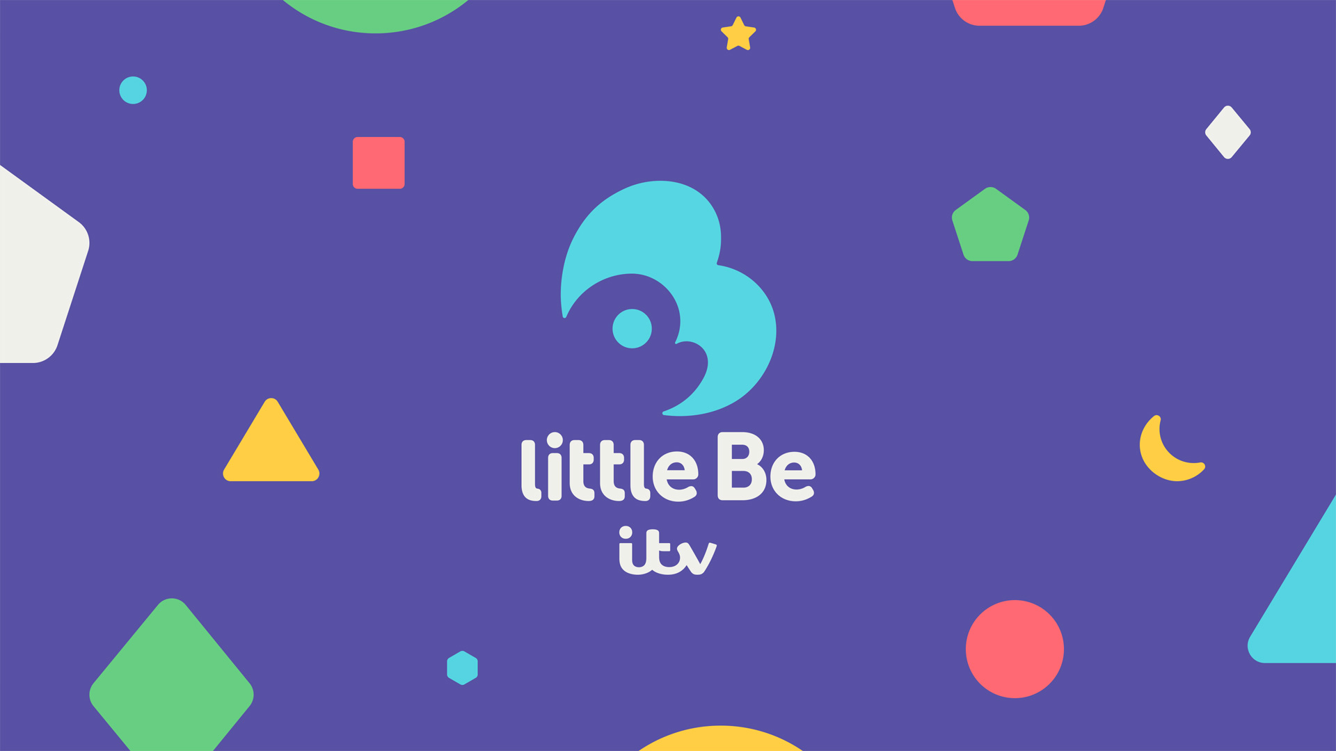
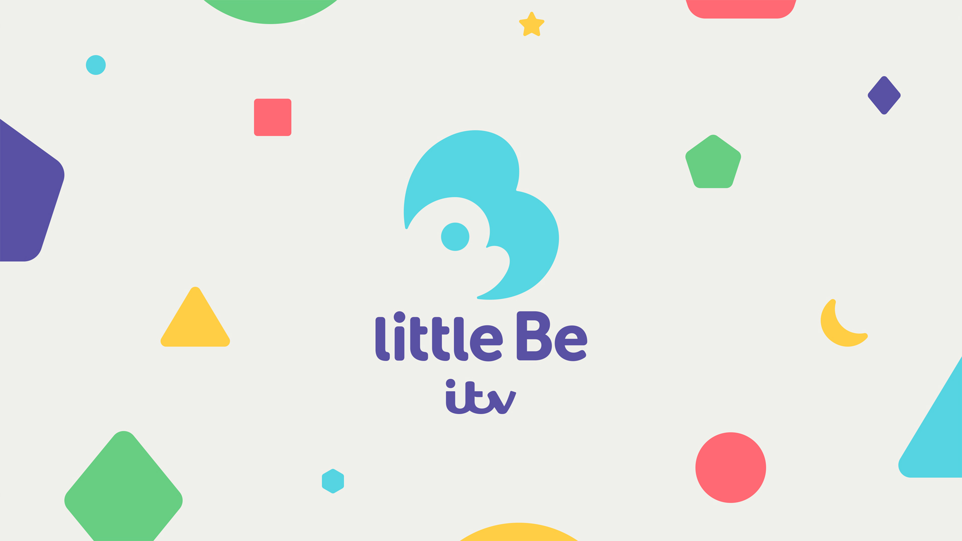
At ITV I had the opportunity to work in a creative team to create a logo and visual theme for a preschool kids zone called ‘littleBe’ to feature weekday mornings from 9-12 on ITVBe. This launched September 2018.
SOLUTION.
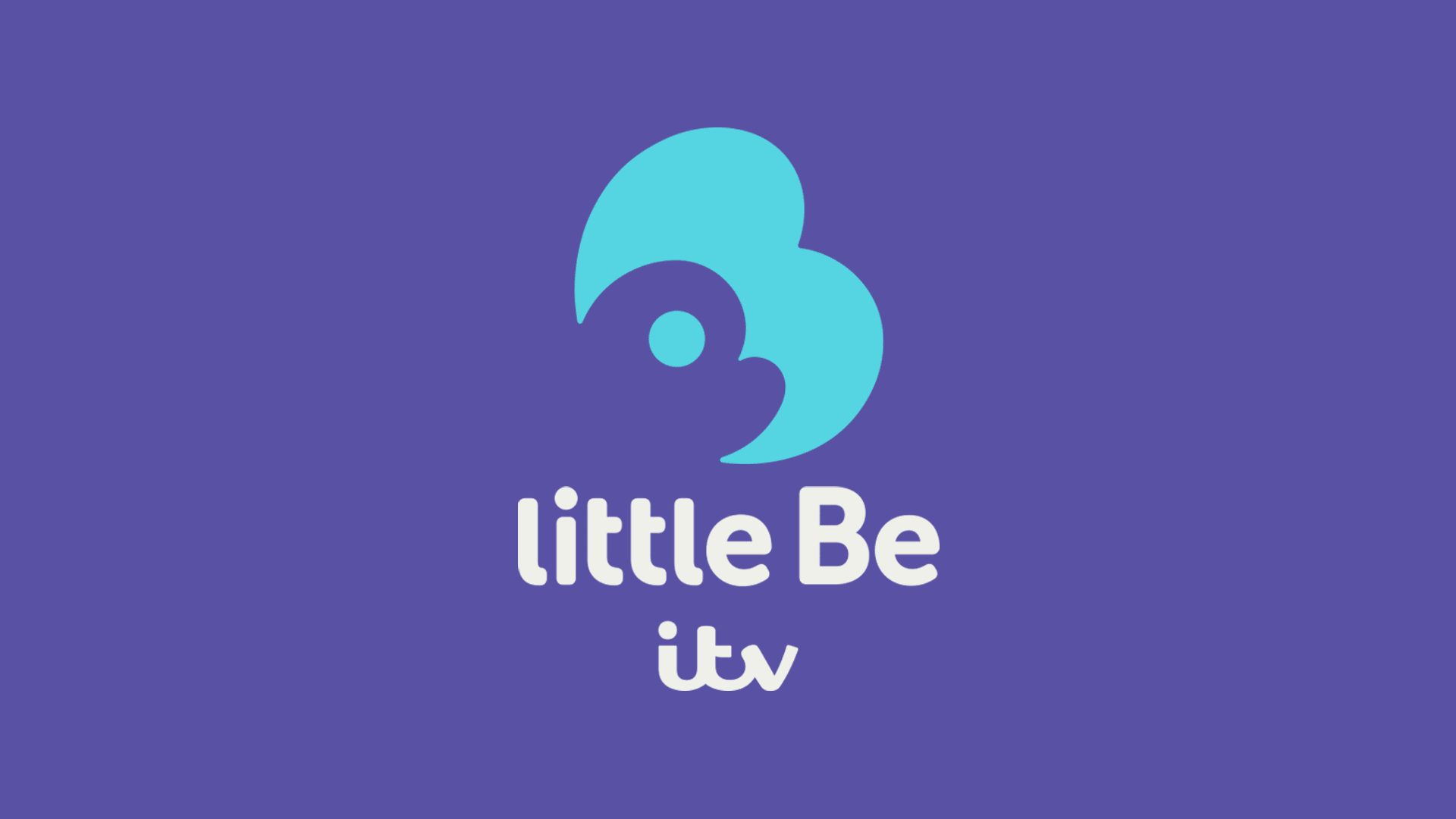
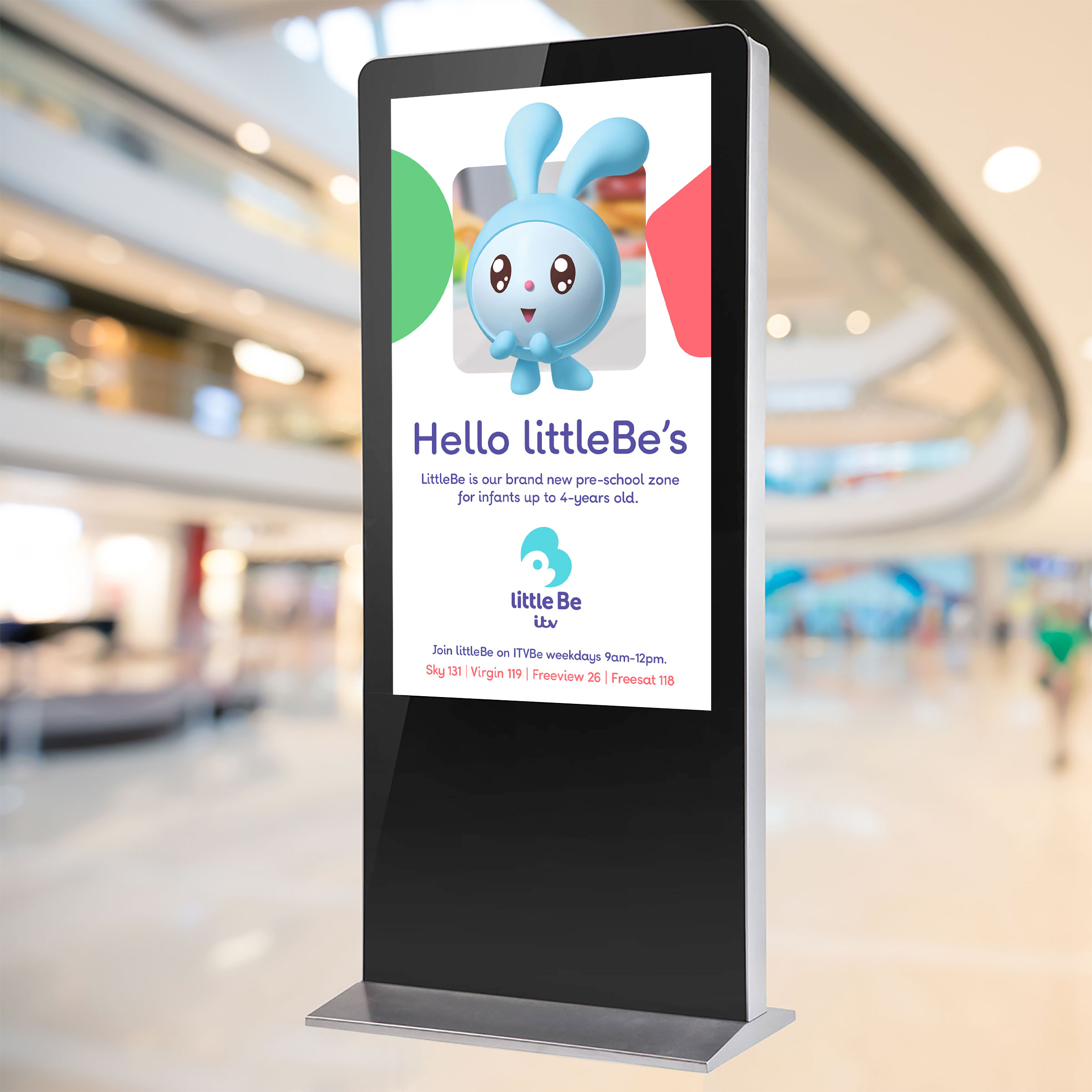
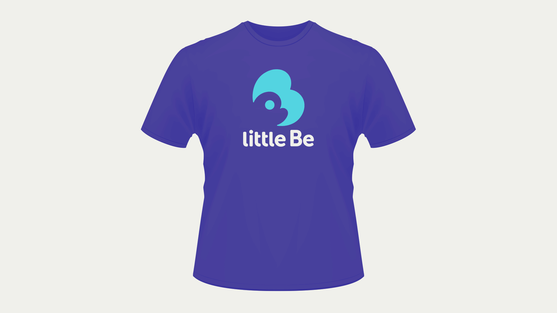
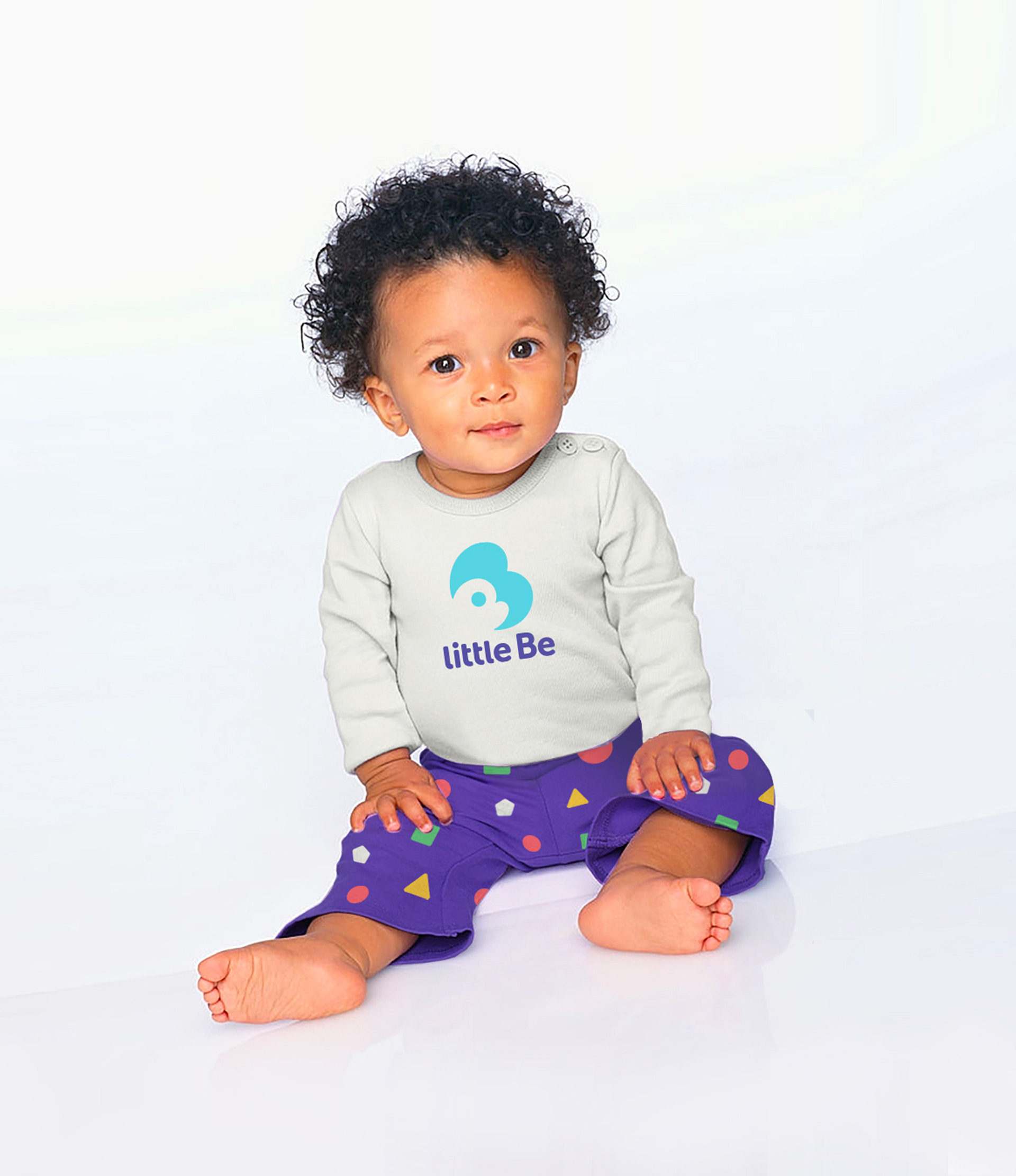
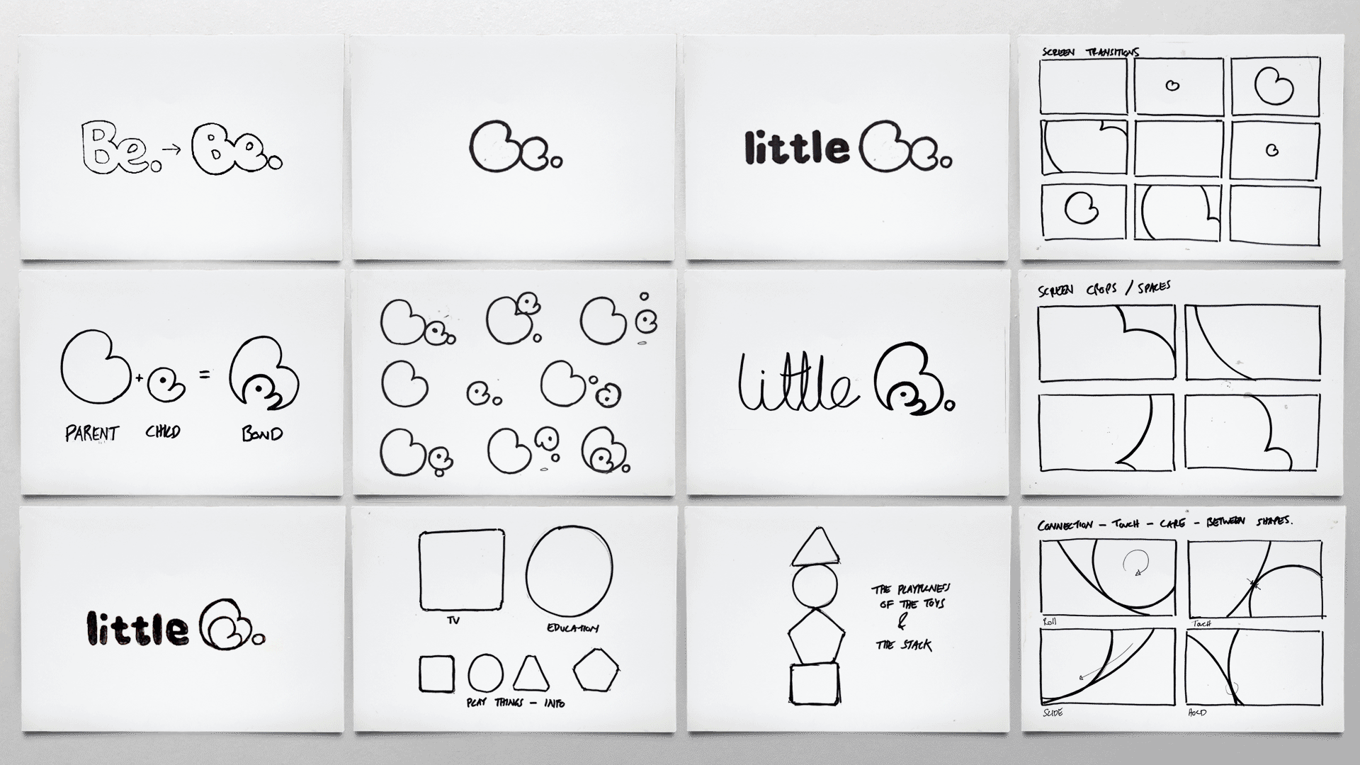
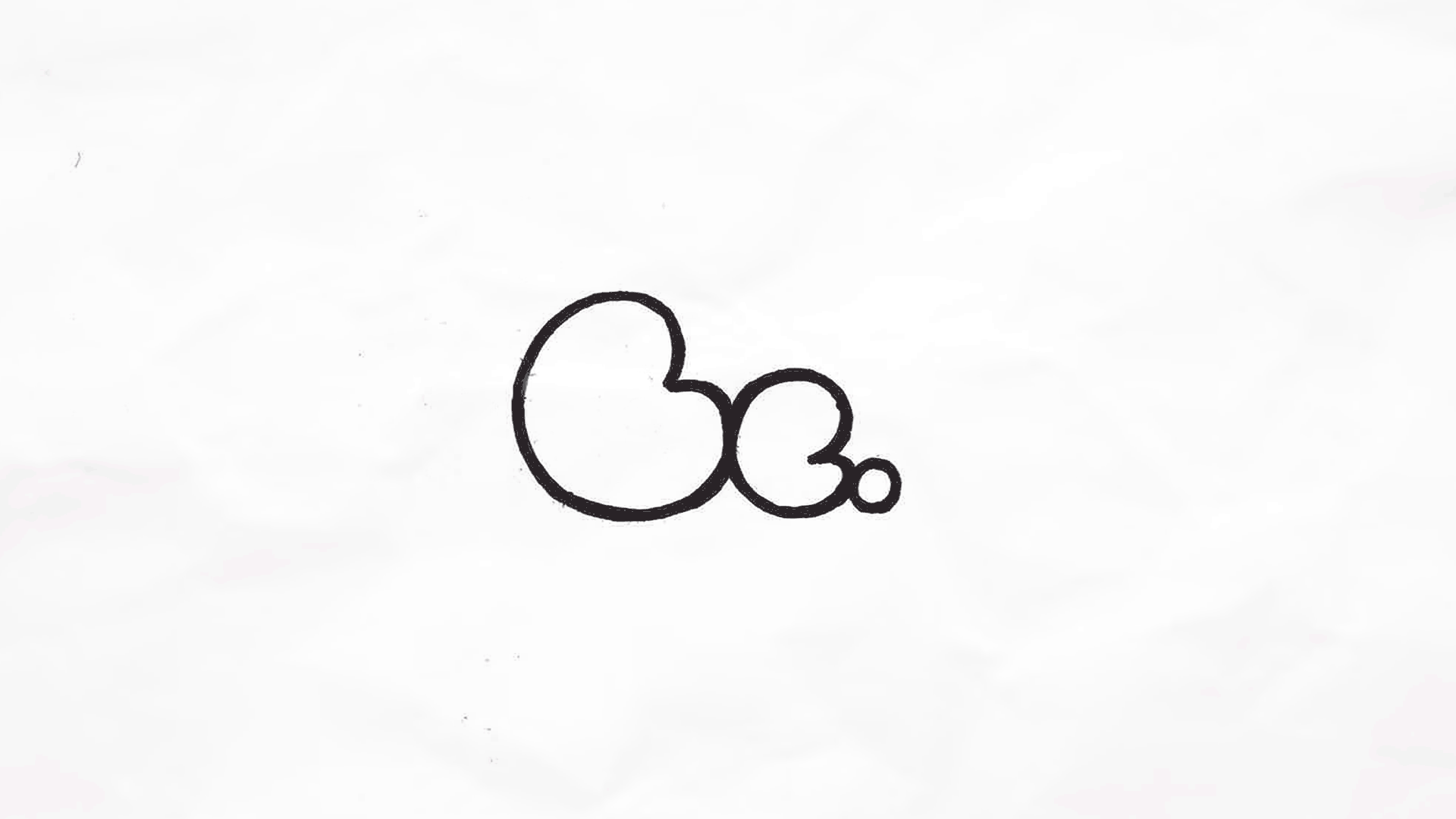
A celebration of the relationship between adult and infant. This is symbolised in the logo composition, The ‘e’ nestles in on the ‘B’ as if cradled and sheltered by a guardian. This comes to life during the kids zone in a series of playful activity animations.
The logo result is a friendly, memorable and own-able graphic, combined with a custom logotype to perfectly communicate the brand.
RESULT.
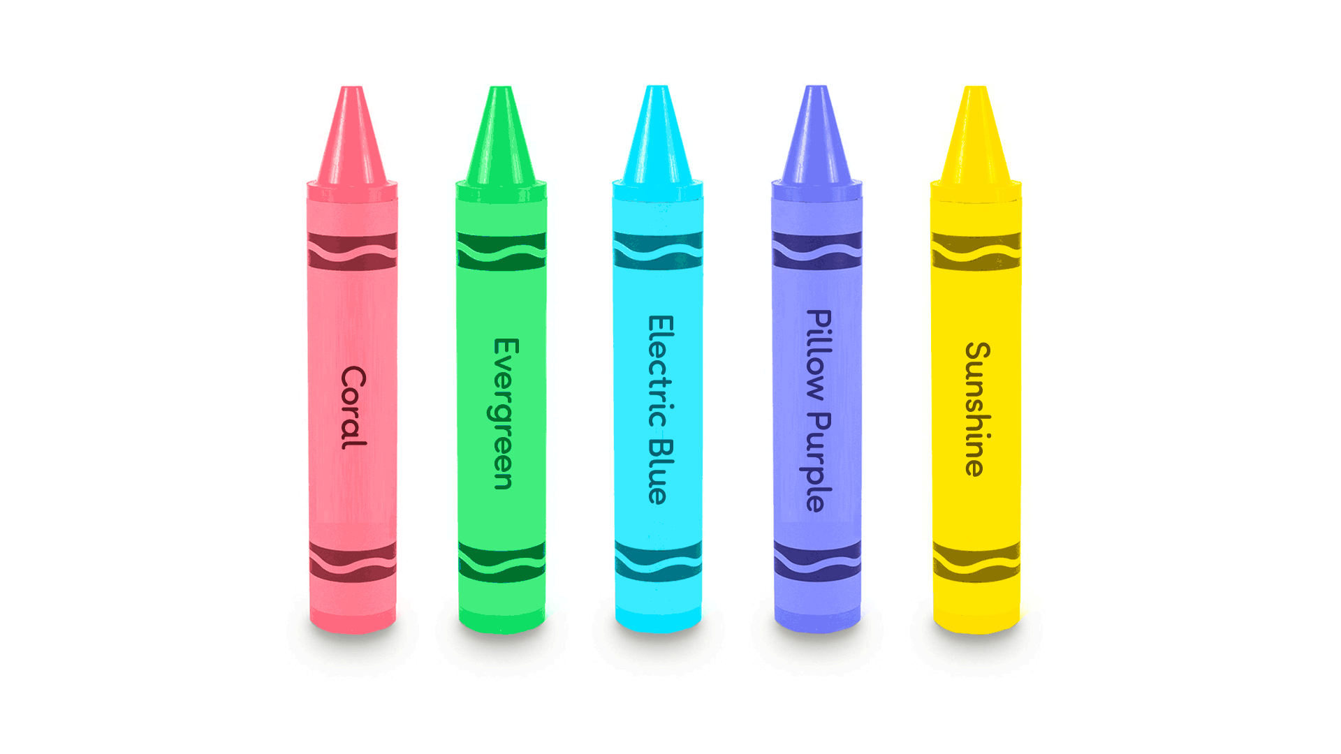
The branding gives the children programmes a littleBe wrapper; Simple in graphic style and utilising a specific set of colours, an overall treatment that an audience under 4 are more responsive to.
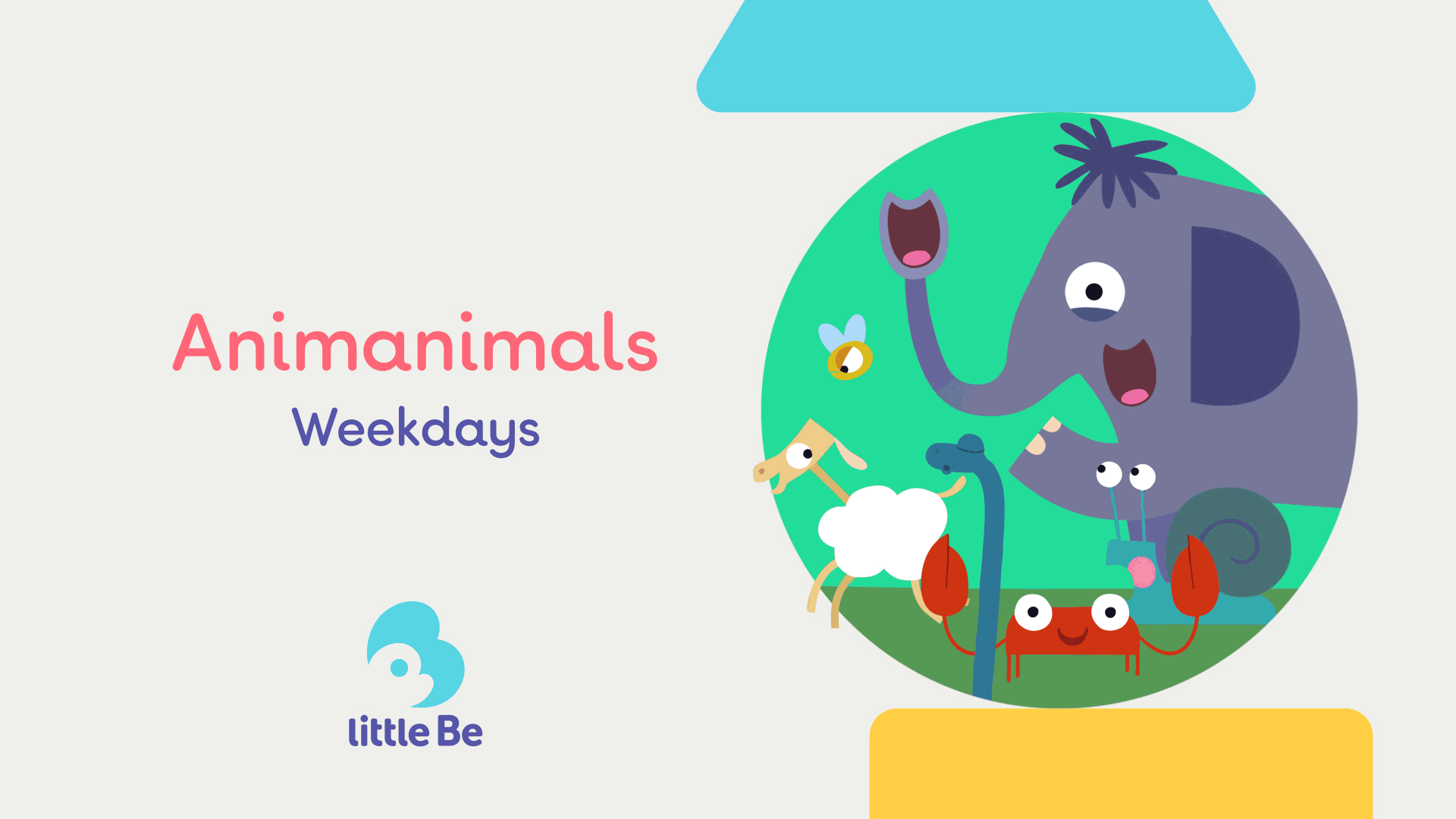
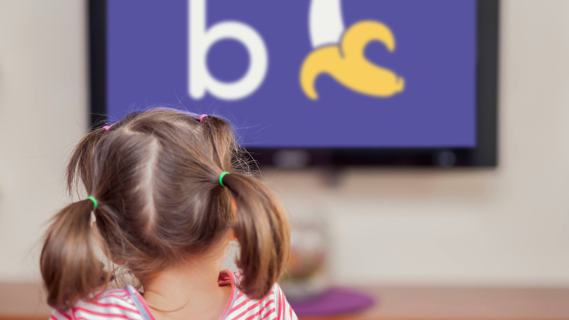
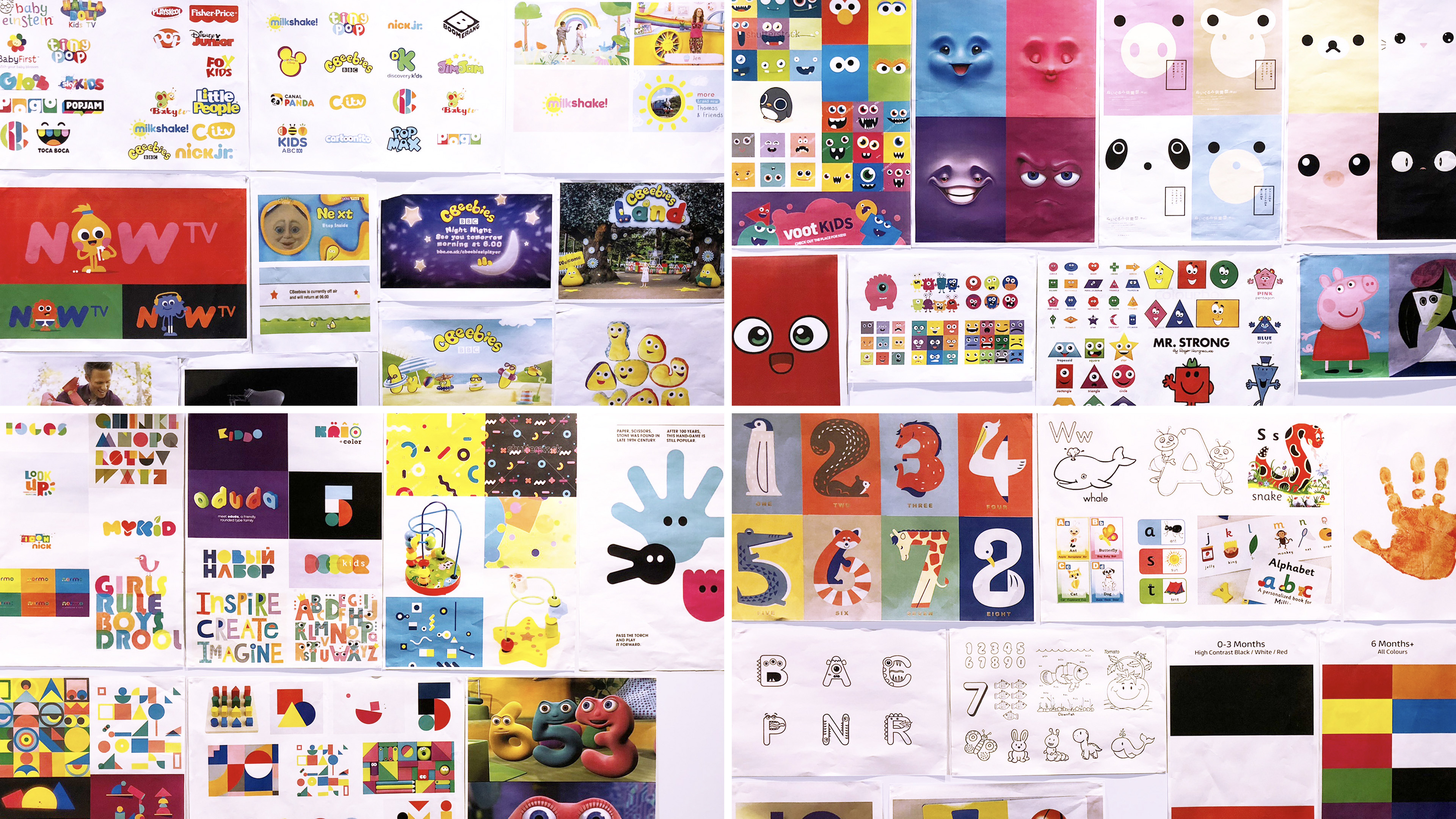
To enrich the viewing experience for a preschool audience we wanted to feature early learning segments. These segments are carefully crafted to engage an audience up to 4 years old.
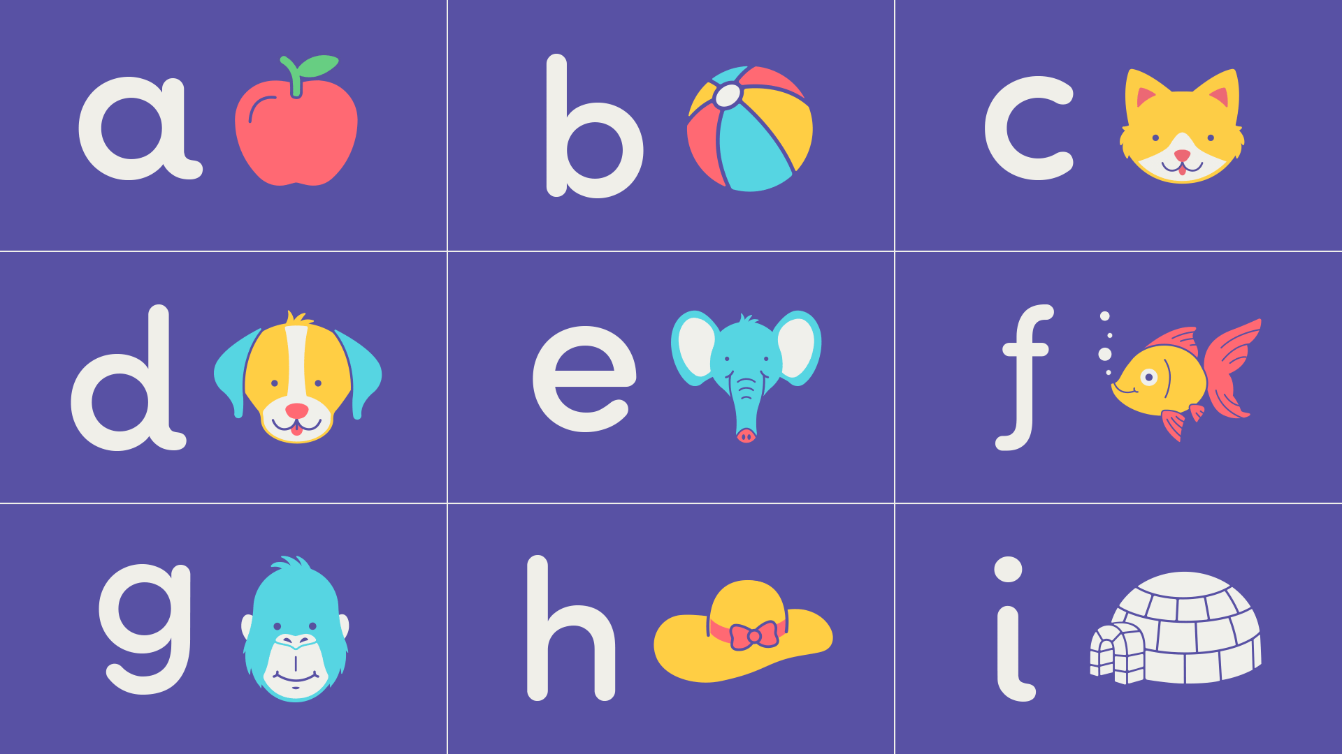
We wanted to include these to help our littleBe’s with their early learning, teaching Shapes, Counting and Phonetics. These are peppered across the zone during the day between shows and add breaks.
VARIATION.
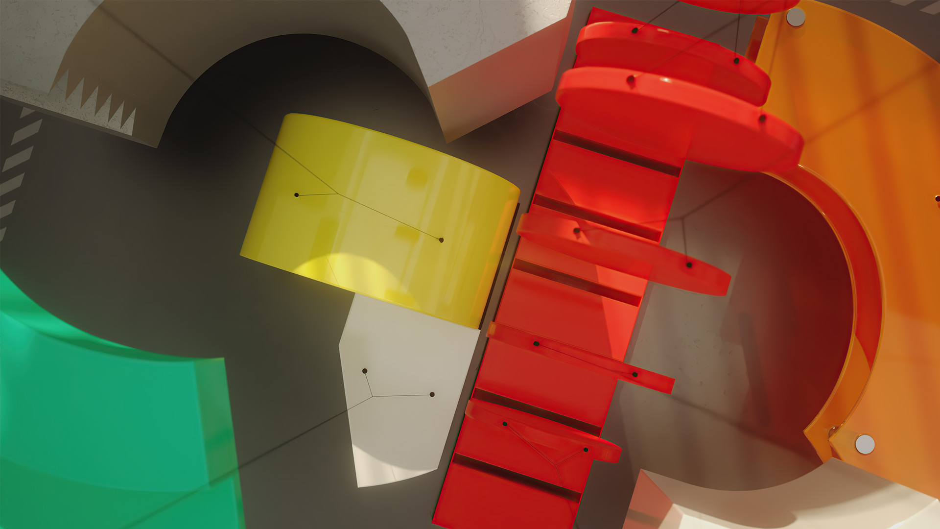
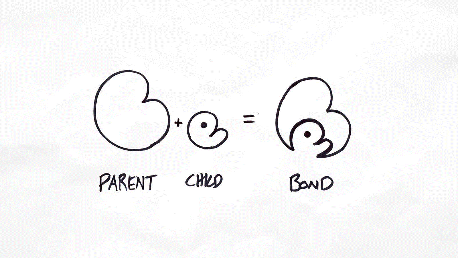
It occurred to me that the letterforms ‘B’ and ‘e’ could come to life and play with each other. This relationship could reflect the fun dynamic between guardian and child. We could create a logo that was alive, that moved and had a playful and charming dynamic. Something both preschoolers and parent could respond to.
For the static logo, the relationship was symbolised distinctly in the logo composition, The ‘e’ nestles in on the ‘B’ as if cradled and sheltered by a guardian, utilising negative space to create the logomark.
This created an interesting visual paradigm where the ‘B’ and ‘e’ could exist together as one or independently. This created the playful animation sequence where they jump apart at the start of the day ready to play and back together again at the end of the day for protection and comfort.