

Imagine you’re the founder of Chupa Chups, the world’s most well known lollipop manufacturer. Your product is a delicious and innovative candy. Naturally, your target audience is the sweet loving children of the world. You need a logo for your brand that entices children to want your candy and parents to allow them to have it. How do you do this?
When your main consumer is children, you’re going to have to get creative when it comes to branding. Children aren’t excited by modern design or subtle colours. These design styles are generally reserved for premium brands that target adult customers. So how do you design for children?
Colour! Bright, vibrant colours that are as positive and lively as the children they’re targeting. This is especially true when your brand is confectionery! Something as sweet and enticing as candy must have packaging and a logo to match. So when Enric Bernat, founder of Chupa Chups, was unhappy with his current logo, he was lucky to be complaining about it over coffee with the man who would end up perfecting it.
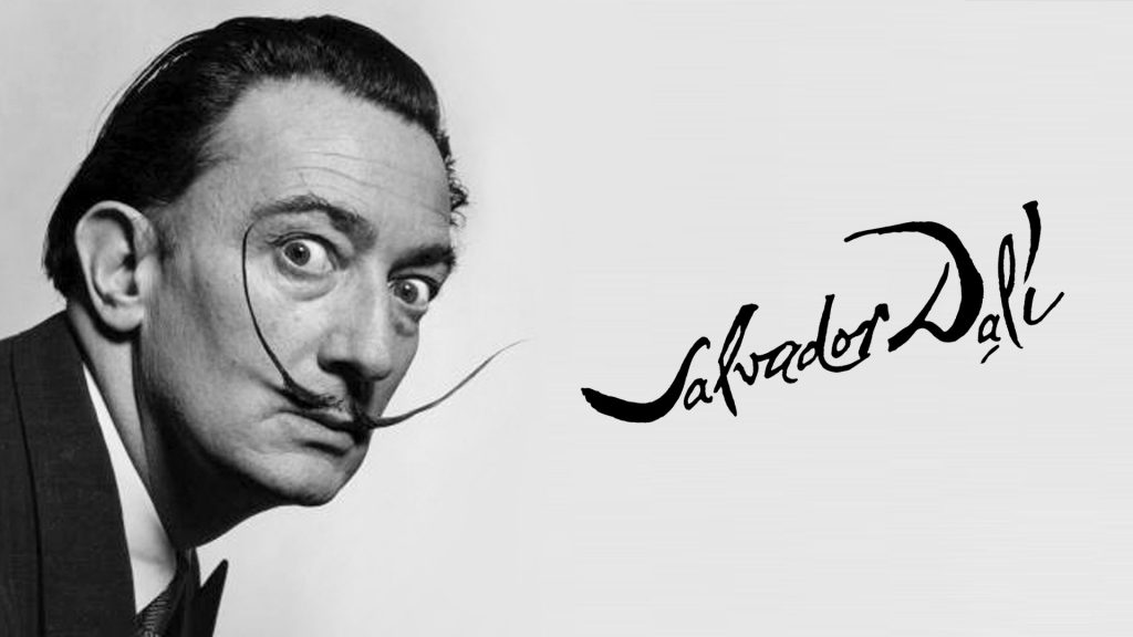
Salvador Dali
That’s right, Salvador Dali, the famous Spanish surrealism artist. The two men were good friends and when having coffee together one day in 1969, Bernat shared his concerns about his logo with Dali. In response, Dali offered to redesign his logo.
1931
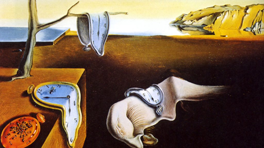
Salvador Dali is not known as a graphic designer, nor is he known to have designed any other logos. He’s most well known for his otherworldly surrealist paintings, such as The Persistence of Memory. But he was also known for never saying no to work, so naturally jumped at the opportunity to design the Chupa Chups now world famous logo.
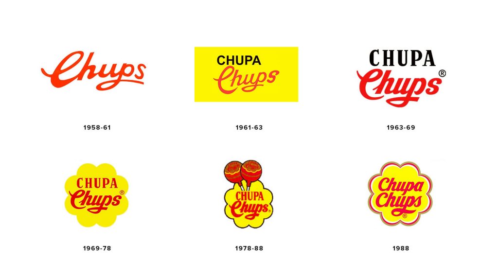
Now, some say it took Dali as little as an hour to sketch out the wordmark in the daisy shape. Others say he spent hours scribbling on newspapers to get the right combination. However it came about, Dali presented Bernat with his current Chupa Chups wordmark inside a yellowy-orange daisy shape.
The Logo
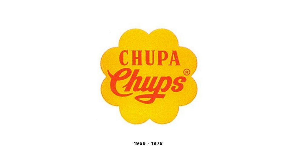
It was simple, yet striking. This simple change made the Chupa Chups logo an emblem logo. Encasing the wordmark within the daisy shape makes it a self-contained emblem logo that is only ever used in one instance, changing only in scale.
The current logo differs slightly from Dali’s design in one small way; the typeface. The current logo uses a fully lowercase script font, whereas Dali’s design incorporated a bold, capitalised serif font with the lowercase script font.
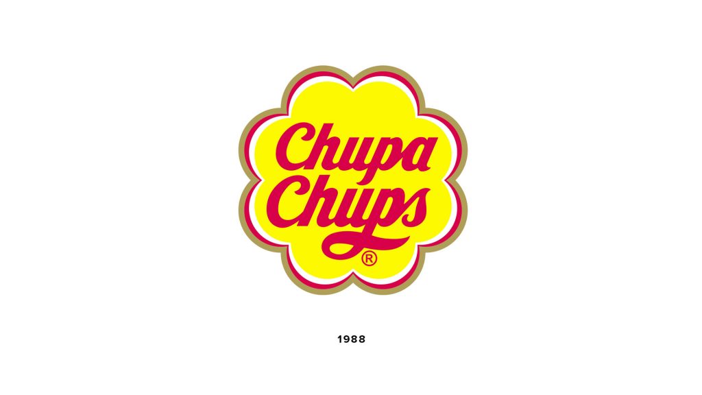
In 1988, the logo was updated slightly to what we know it to be today. This update included the change to the all lowercase script font and a vibrant yellow background instead of a yellow orange. It also included the addition of three strokes to the outside of the daisy shape of red, white and gold.
The bright colours used are perfect to appeal to the target audience; children. Yellow signifies youth, optimism, cheer, energy, positivity and joy, while red is used to symbolise passion, love and excitement. The addition of the gold colour to the outermost stroke signifies an air of magic and value, which is exactly what you expect from sweets.
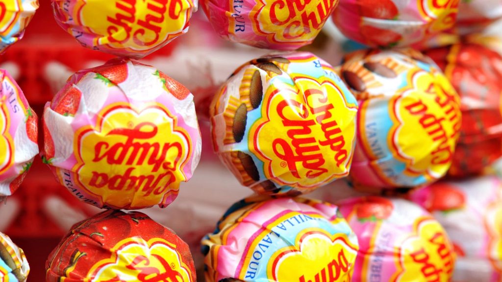
The combination of these bright colours compliment each other, rather than clash. They work well to appeal to children and to the child in every adult. They also help the logo stand out so it can be used on any background. This is important as the brand makes a wide variety of flavours and needs a logo that stays strong and prominent, no matter the background colour.
The use of the daisy shape is the cherry on the cake, so to speak. The product is a solid sugar globe on a stick, made for children. A simple circle may seem appropriate, but this would be too boring for children. To make things more exciting, why not swap a circle for a daisy? This adds character and charm to the logo that a regular shape may lack, therefore increasing its appeal to a youthful and positive audience.
What do I think of this logo?
I think that the success of this logo is partly to do with it being an emblem. Prior to Dali’s design, the logo was simply a wordmark. Words that would otherwise compete in a sea of words in an advertising and marketing environment.
By placing the wordmark within a shape, the logo becomes more distinctive. Especially when the shape itself is unique. Not only does it become more distinctive, but it creates an emblem logo that, like most emblem logos, works really well.
Emblems are always seen in the same instance and generally only scale up or down when used in different media. The wordmark is never seen separate from the daisy shape, making for a globally iconic logo for a globally loved sweet.
Dali’s suggestion to move the logo to the top of the sweet is a stroke of branding genius. The daisy shaped logo fits perfectly on top and quickly grabs your attention.
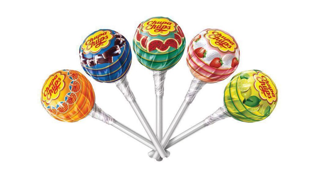
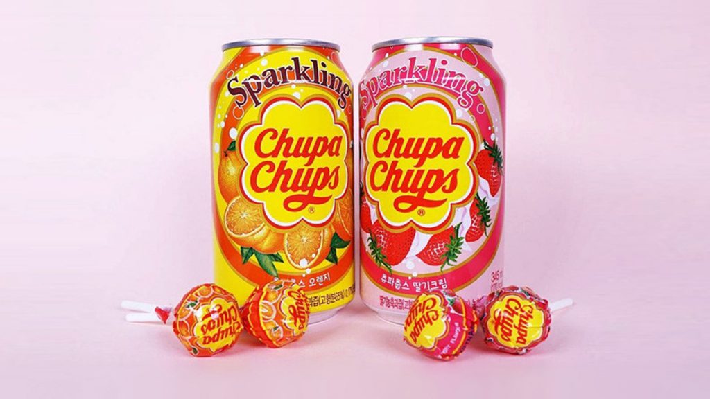
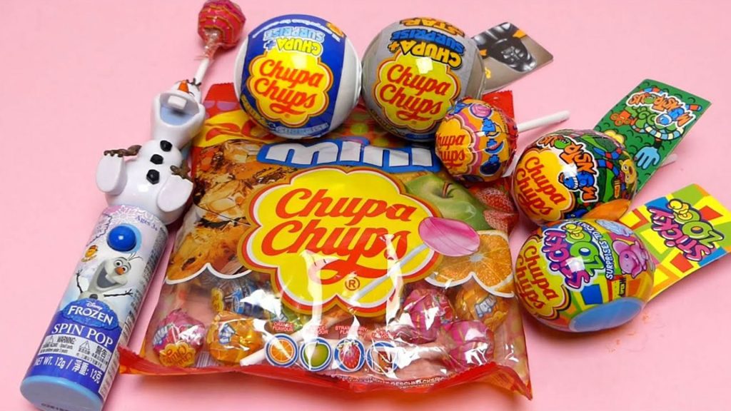
To further prove its success, the logo also works well on the new range of products Chupa Chups have released. This shows the versatility of an emblem logo and how it works well in various environments.
What can we learn?
When you think about it, Dali didn’t really change the original logo too much. He simply changed the shape the wordmark was sitting in, thereby enhancing the original logo. It wasn’t a big change, but it was a very smart one.
This goes to show how small decisions can have big ramifications which occurs a lot in logo design. The daisy shape is what everyone thinks of when they think of Chupa Chups. It’s iconic! These types of logos typically don’t change much as they work so well. The idea of the Chupa Chups logo has remained the same for more than 50 years.
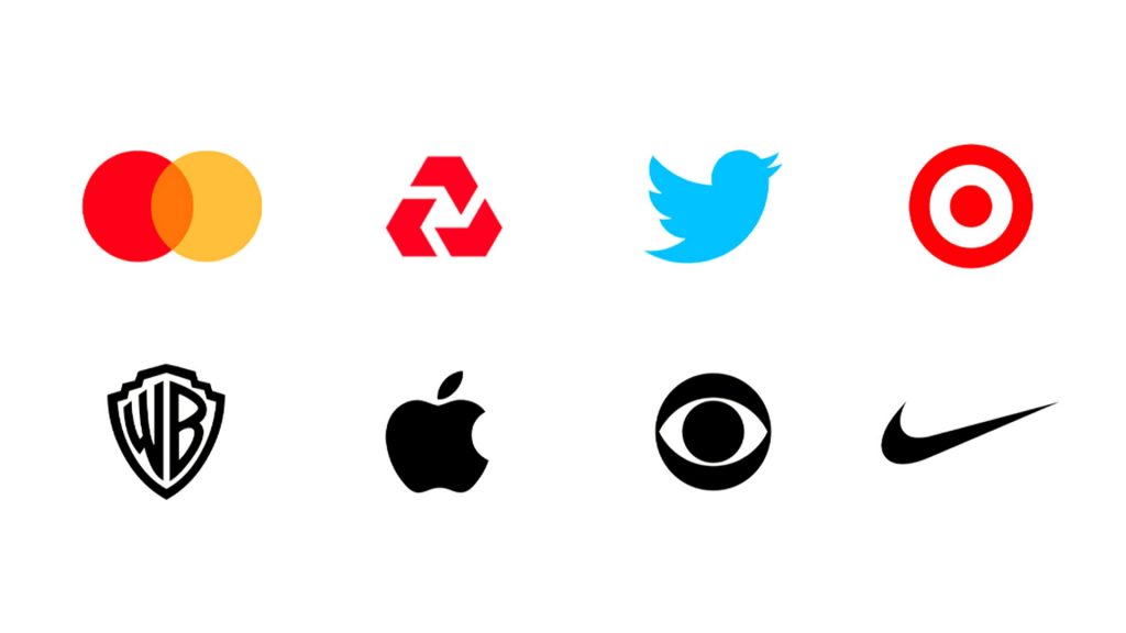
The Chupa Chups logo reaffirms the idea that the visual element ‘shape’ is very iconic and works well as a logo. When you think of brands like Mastercard, CBS, Warner Brothers, Target and Nike, they haven’t really changed much either. They incorporate some simple, yet very memorable, shapes. When you see these shapes you instantly think of the brand associated. It’s perfect branding!
So, when creating a logo, remember how powerful shape can be in achieving a striking and memorable logo. Remember that you cannot use any old shape to achieve this. There should be a reason, which should align well with the brand and their goals or values. It may just stay with the brand for a very long time, so use shape well.
So what are your thoughts on the logo? Do you think the daisy shape works as its intended? Did you know Salvador Dali’s involvement in the logo? Let me know in the comments below and don’t forget to check out our other logo reviews!