


What do you look for when choosing a bank? It’s likely not the logo, but rather the qualities and reputation of the bank. However, logos are usually one of our first interactions with a brand and therefore must work to communicate a brands qualities and reputation. This was the aim of Deutsche Bank when they were redesigning their logo in 1973. A logo that represents the qualities customers look for in a bank that is not only recognisable, but also timeless.
If you take a look at some well known banks, you’ll see a range of logo styles, from complex to simple. Amongst them, Deutsche Bank would be considered one of the simpler styles, however this wasn’t always the case.
The History
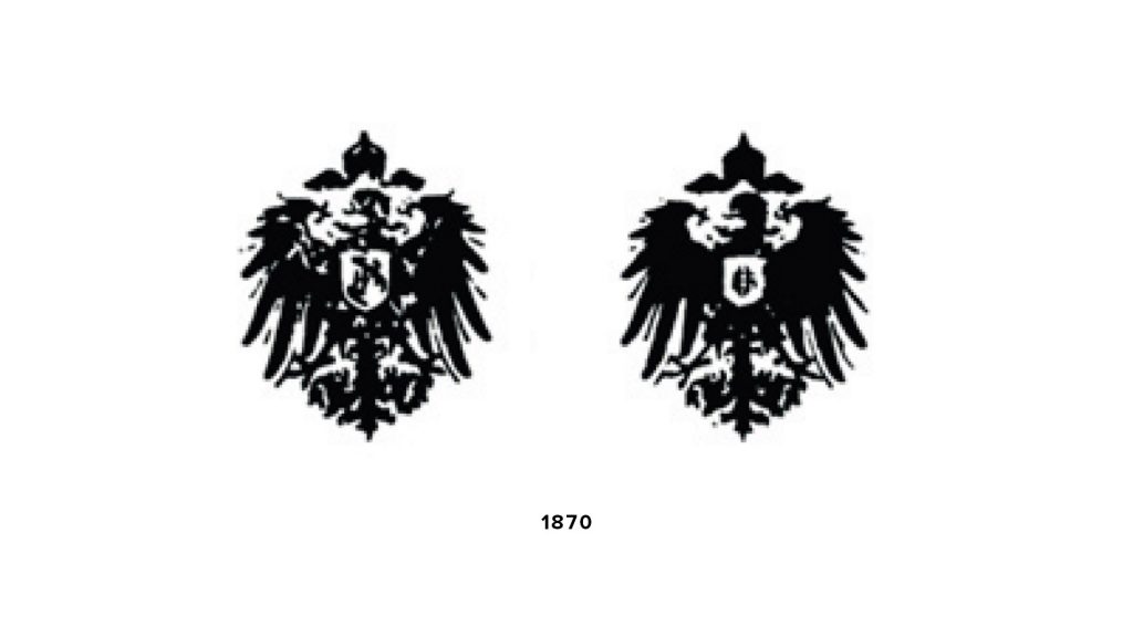
In the 1870’s when the bank first opened, the logo was an imperial eagle with one variation. As you can see, this is a much more detailed and complex logo than the current one, but it was quite common for the time.
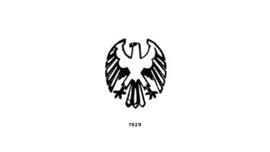
This logo remained until 1929, when the bank merged with its rival Disconto-Gesellschaft, forcing a simplification of the eagle.

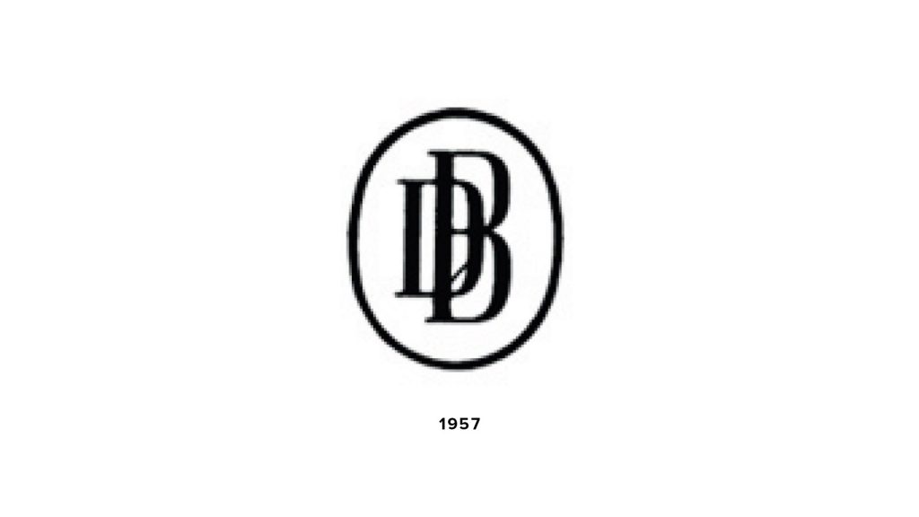
Then, in the mid 1930’s, the logo underwent another change to simplify yet again. This time removing the eagle altogether and sticking with the simple monogram style logo that Deutsche Bank refers to as “DB in an oval”.
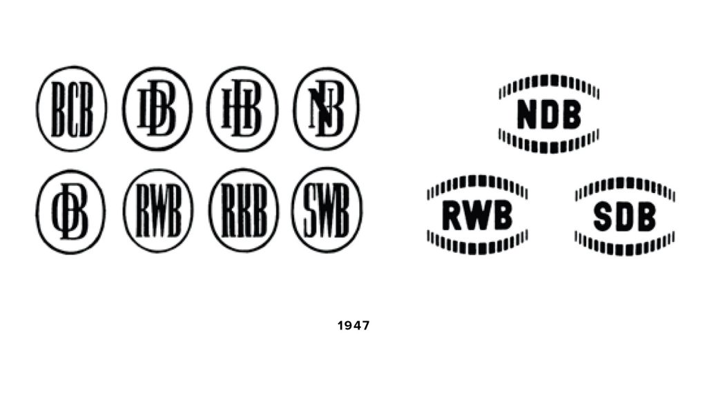
As the company grew, autonomous institutions from the bank formed, each with their own variation of the “DB in an oval” logo (left) or stylised coined rims (right). These were used from 1947 until 1957, when the bank decided to stick to the one variation of the “DB in an oval” logo, as in the 1930’s.
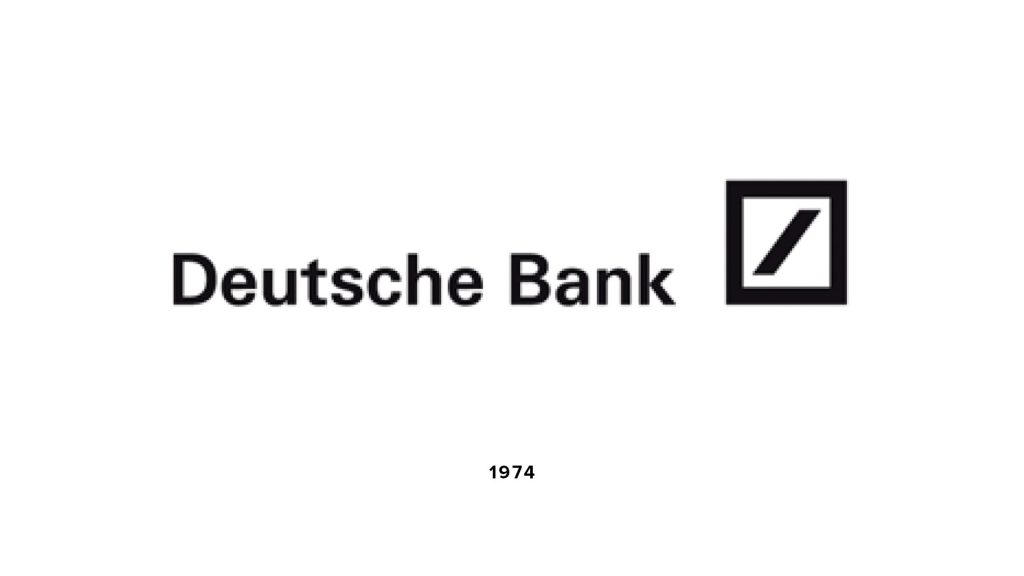
Finally, in 1973, Deutsche Bank decided it was time to do away with imperial eagles and bland monogram logos. It was time to find a logo that would stay with them for years to come. A logo that could be understood globally, no matter your language. A logo that represented the company’s values and what a customer received when banking with them.
Anton Stankowski
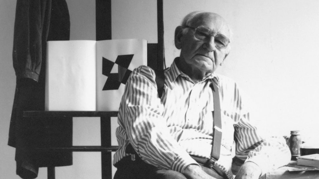
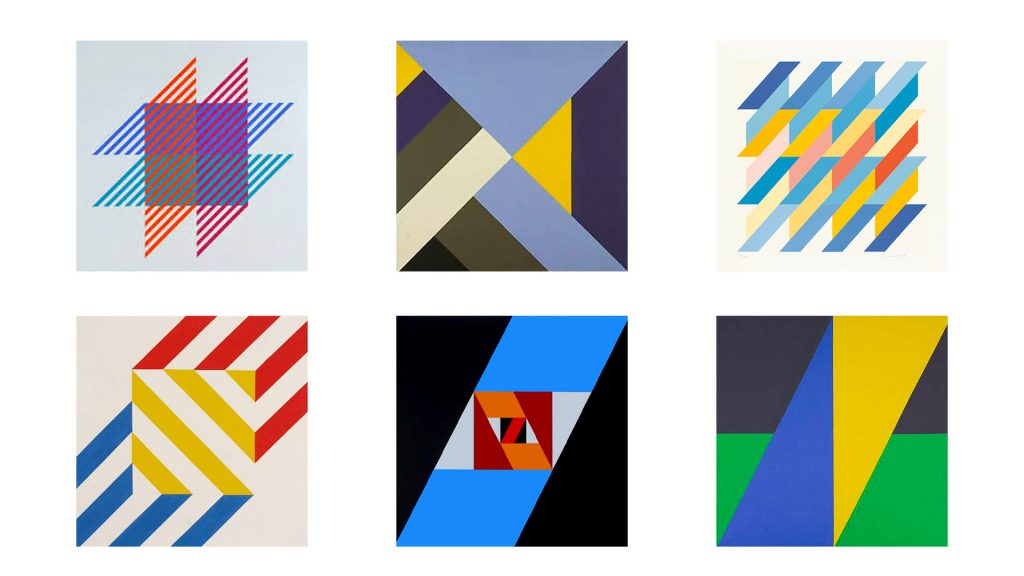
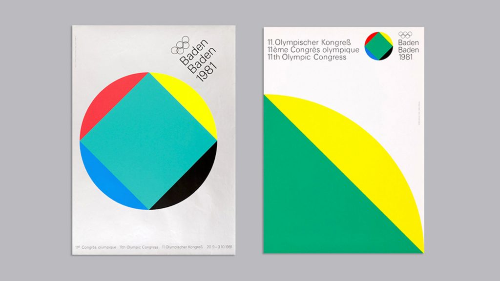
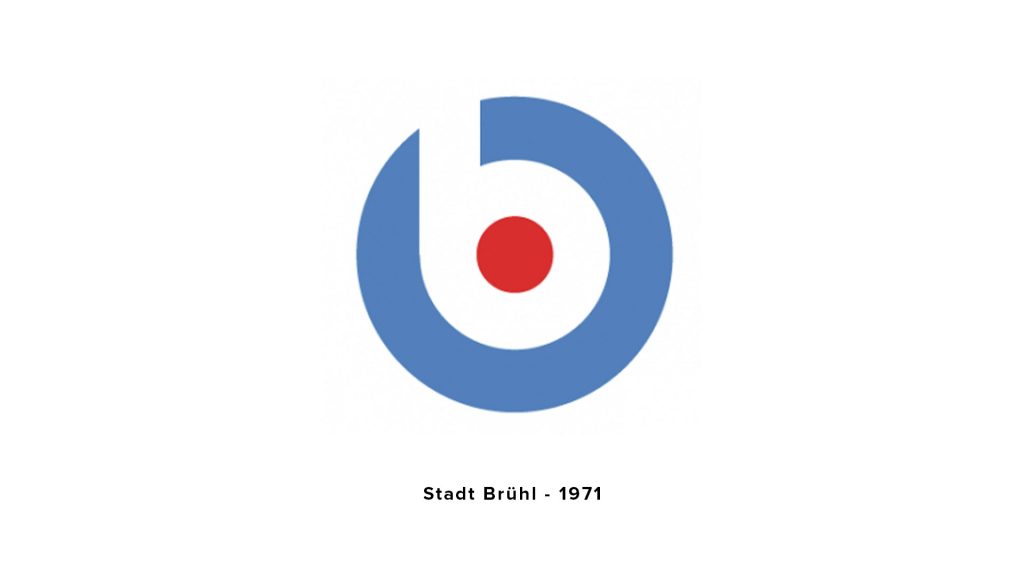
Anton Stankowski was well known for his constructivist-style of work which he incorporated in both his design work and his art. Stankowski was renown for creating a logo for Stadt Brühl in 1971 and the identity for the Olympic Congress Baden-Baden in 1981.
In 1973, along with eight other leading designers, he was commissioned to design an updated logo for Deutsche Bank that reflected their growing product offering and increasing international presence.
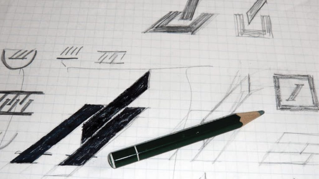
Stankowski brought his constructivist-style to the table and produced the logo we know today. As seen from his sketches, he tried a few variations of his iconic slanted lines before settling on the “slash in a box”, as it’s become known. This was the winning logo for numerous reasons.
The Logo
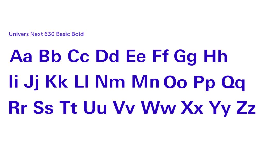
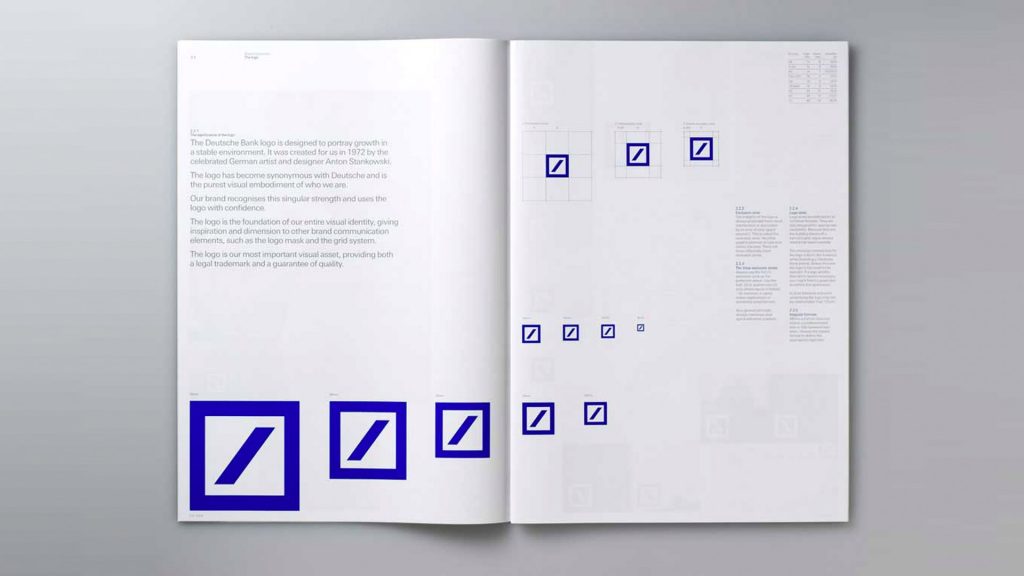
The Deutsche Bank logo is essentially a lockup combination mark. However, since 2010 the logo has been used more as a separate wordmark and logomark. The prominent logomark consists of a thickly outlined square with an angled slash running corner to corner. The wordmark uses a sans serif typeface called Univers Next 630 Basic Bold.
Stankowski’s logo efficiently expresses what customers get when banking with Deutsche Bank. The thick slanted line represents forward movement, upward consistent growth and dynamic development. The box it sits in represents a stable, secure environment. Therefore, the logo itself represents growth in a stable environment.
“Dynamic, ascending and secure. A security within a certain reliable and responsible space, in which percentages fluctuate.”
Anton Stankowski
According to Deutsche Bank, the logo meets the quality criteria required for a premium brand, including:
- “simple yet striking form, able to generate and ensure recognition.
- supporting the identity of Deutsche Bank.
- consistent frame of reference.
- “slash” stands for consistent growth and dynamic development.
- the square-shaped frame can be interpreted as a sign of security and a controlled environment”
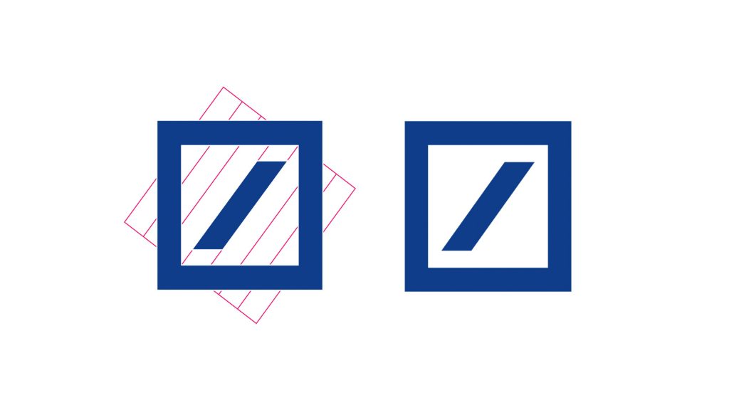
The slash tilting to the top right corner is also reminiscent of an uptrend in the financial markets. This indicates positive growth and profits, both of which are positive associations for a bank. At this slanted angle, the logo is also symmetrical.
Stankowski presented the logo to Deutsche Bank in a simple black on a white background. The logo remained this way until 2010 when the company decided to allow more flexibility with the logo.
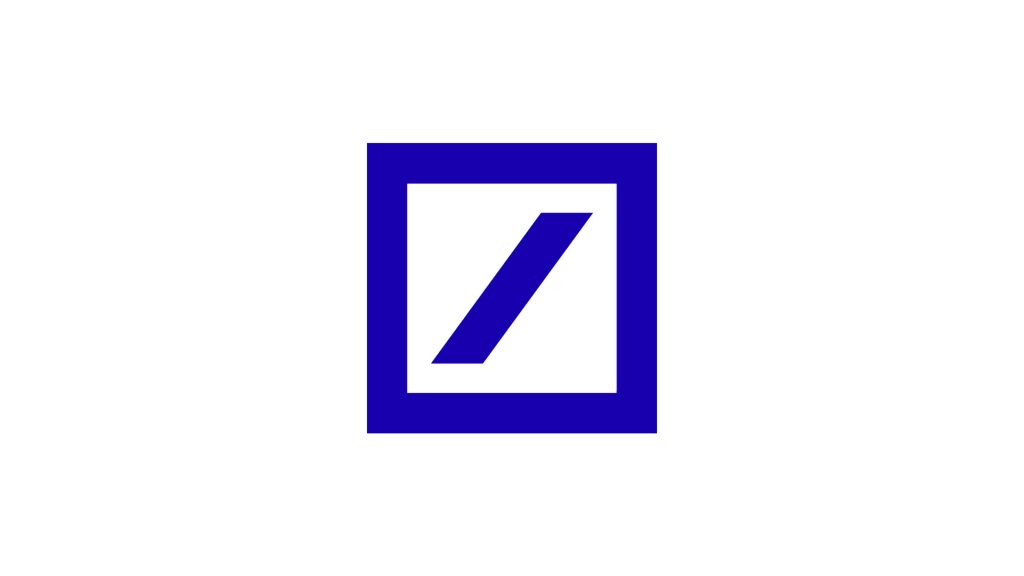
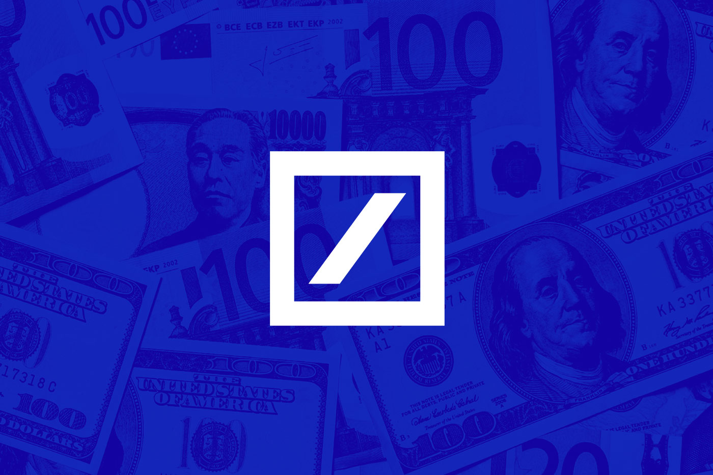
From 2010, the logo was not only being used as a logomark separate from the wordmark, but was also now a deep blue. The choice of blue as the dominating colour is a common one for many corporate companies. In fact, 33% of the top 100 brands use the colour blue in their logo. This is no coincidence either.

The colour blue represents trust, loyalty, depth, stability and confidence. Now, for many companies, this is what they want their customers to see them as; trustworthy, loyal, stable and confident. For a bank, these qualities are even more important! This is where people trust their money to be kept safe, so they want a bank they can trust and ensure stability with.
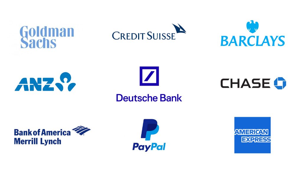
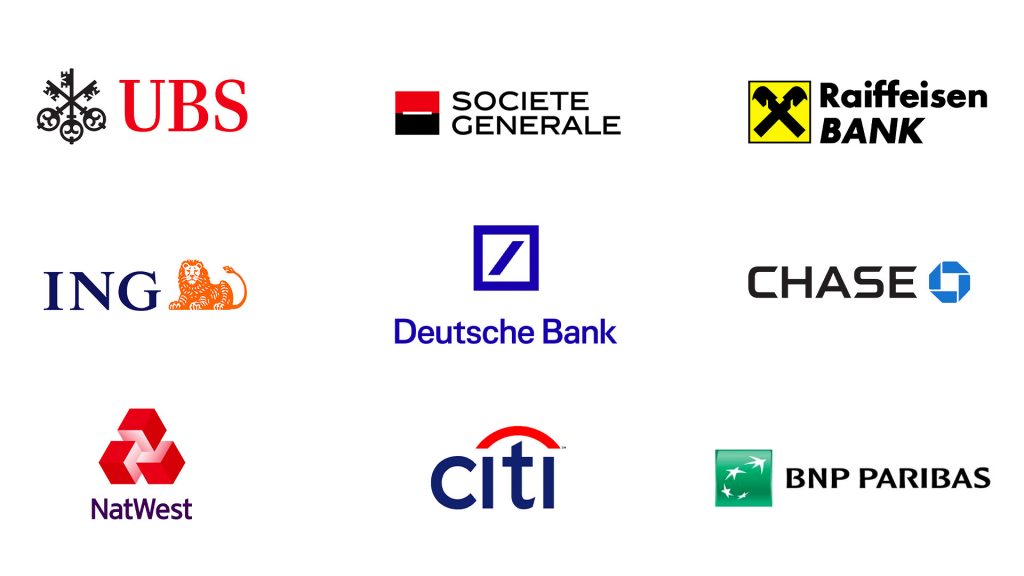
If you take a look at the logos of some top banks and financial services, you’ll notice most use the colour blue. Therefore, the colour choice didn’t set Deutsche Bank apart from every other bank, but rather helped them fit in with the trusted paradigm.
What did make Deutsche Bank’s logo different and help them stand out was the simple yet timeless design, paired with a simple and timeless typeface. This logo has lasted Deutsche Bank almost 50 years and could easily continue for another 50 or more.
The timelessness of this logo means customers can always rely on Deutsche Bank as its familiar logo doesn’t change and can be recognised around the world, no matter the language spoken.
The simplicity of the logo has aged well, with the bank saying that it “meet[s] the needs of today’s media convergence where clear iconic symbols are essential”. This is evident as we are seeing many more companies simplifying their logos. As Deutsche Bank has been using this logo consistently since the 70’s, they could be seen to be ahead of the curve.
The Deutsche Bank logo has become one of the most iconic logos of all time and sits at number two in Creative Review‘s top 20 logos of all time.
What do I think?
This logo is not just a stamp or some interesting, unique or distinctive shape. Yes, the logo looks dynamic, but most importantly the logo communicates a positive message. The kind of message which will never grow tired and that any corporate company would want to get behind.
There is a strong visual narrative, as well as movement and direction in Stankowski’s design. With its immense simplicity and boldness, the resulting logomark is dynamic, distinctive and memorable. It still looks as striking now as it did when it first appeared back in 1974. This is an excellent example of how simplicity makes for a timeless logo.
What can we learn?
When creating logos, consider how simplicity, along with a strong narrative, can help form timeless logos. Also consider how these aspects have worked so well for this logo and how they may benefit your design.