

As one of the most iconic graphics in the world today, it’s hard to believe that the I Love New York logo has only been around for less than 50 years. Emblazoned on t-shirts, mugs, keychains, bags, snow globes and anything and everything a tourist may buy, the logo is so synonymous with New York that it could only have been designed by a true New Yorker. The New Yorker we have to thank for this iconic and widely imitated logo is no other than Milton Glaser.
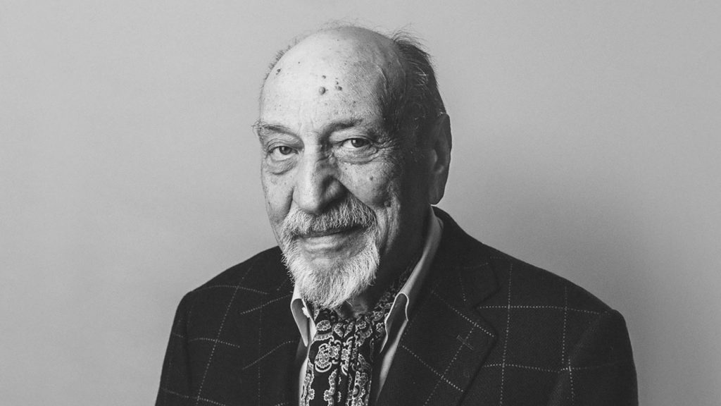
Milton Glaser
During the 1970’s, New York wasn’t a place many people wanted to visit. Crime rates were at an all-time high, whereas tourism was at an all-time low. With the state close to bankruptcy and President Ford denying federal assistance, New York State commissioned an advertising campaign to boost tourism and the resident’s spirits. Advertising agency Wells Rich Greene came up with a marketing campaign centred around the slogan I Love New York. They had the slogan, a jingle and even a television commercial. All they needed now was a logo.
Enter Milton Glaser, a successful graphic designer of the time with a portfolio to impress. Glaser was well known for his work on the psychedelic poster of Bob Dylan with CBS records. He was also the the co-founder and designer of New York magazine.
As a born and bred New Yorker, Glaser chose to design this logo completely unpaid. He loved his State and wanted others to see why, so he designed this logo free of charge to help boost tourism. Glaser spent a week designing a logo that visualised the slogan. He submitted design, which was quickly approved. Easy! Then, in the most New York-iest way possible, he was doodling in the back of a yellow cab when the logo we know today came to him. On the back of a torn envelope in red crayon, just four simple characters; I ♥ N Y.
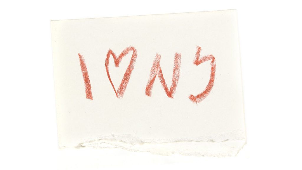
The original imagery derived from my memories of carvings in tree trunks, where the initials of lovers were combined with a heart
Milton Glaser, Art is Work
So, he presented this idea, which was also approved. He made some tweaks and chose the American Typewriter typeface designed by Joel Kaden and Tony Stan, for its “informality” and “literary reference” and how it’s “rigidity” works well with the “voluptuous heart”.
The Logo
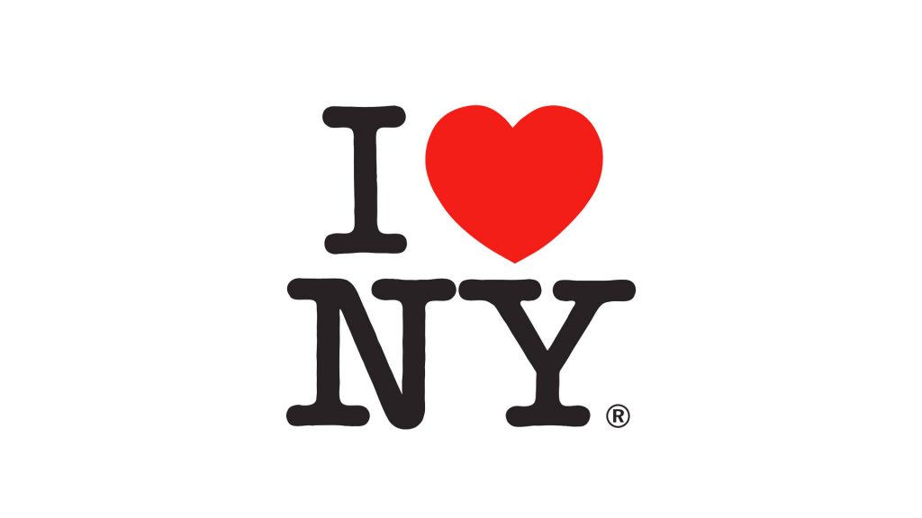
This logo is essentially a lock up combination mark. In this logo we have a lettermark element and an visual shape element. The lettermark is a rounded slab serif typeface, American Typewriter designed by Joel Kaden and Tony Stan.
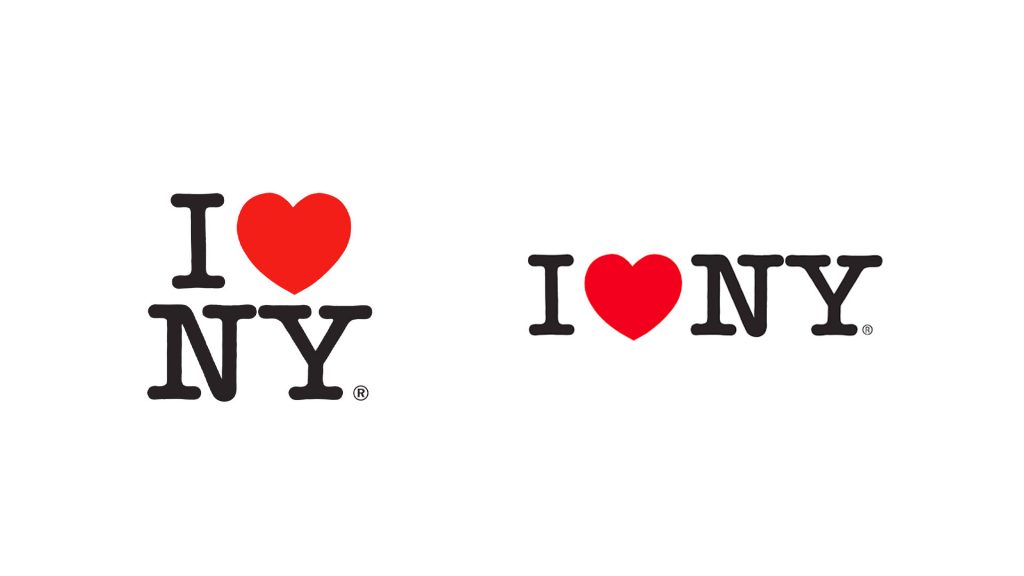
The I ♥ NY logo is commonly seen in two lock up compositions; the stacked composition and the horizontal composition. The heart shaped visual icon is placed in the composition to visually represent the word love.
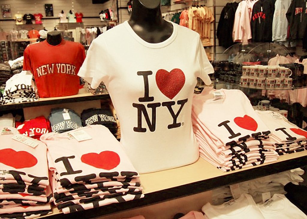
The campaign was only expected to last a few months, however, it became so popular and closely associated with New York that it’s still seen in souvenir shops today. So popular, in fact, that it’s been imitated for many other well-known cities around the world.
“The impulse for everyone I think, going into professional life as a designer, or as a communicator, is to have their work effective, and meaningful… to enter the culture though their work…
Milton Glaser
So everything one dreams of in terms of having an effect, on your culture, your community, your neighborhood, the world,… It happened!”
What do I think about the logo?
This logo is one of the all time classics and ticks all the boxes that make for a good logo. It’s simple, distinctive and memorable. It’s memorable, universally understood and has proven itself to be timeless. The logo is both powerful and impactful and does exactly what it was meant to; boost tourism in New York. What more can you want from a logo?
What can we learn?
This logo demonstrates how visual elements can be used together in a simple and impactful way. It’s a good example of how a logo doesn’t need to be overly complicated and how sometimes simplicity is best. The simplicity of this logo makes it easily recognisable, instantly identifiable and has maximum impact. The use of the heart visual element makes the logo universally understood, which has helped with its popularity.
When designing a logo, consider how these elements have worked so well here and how they may benefit your design. Remember to always carry a pencil and paper on you, as you never know what may come to you and when. Sometimes the most effective and appropriate logo is the one you scribble down in the back of a cab.
Soundtrack that went with the campaign in the 1970’s
See more work by Milton Glaser here
Liked this logo review? See more like this here