

We all know Steve Jobs as the co-founder of Apple, but did you know he also founded another computer company? After co-founding Apple with his high school friend in 1976, Apple saw great success and became a well-known brand. However, after facing some problems with the first Macs in 1985, Jobs was pushed out of his own company.
This didn’t stop him though. He believed in the power of personal computers and what the future could hold. So, he picked himself up and started a new hard- and software company. NeXT Inc., would manufacture computer workstations for higher education and business markets. What Jobs now needed was a brand identity, for which he approached one man, and one man only.
Paul Rand
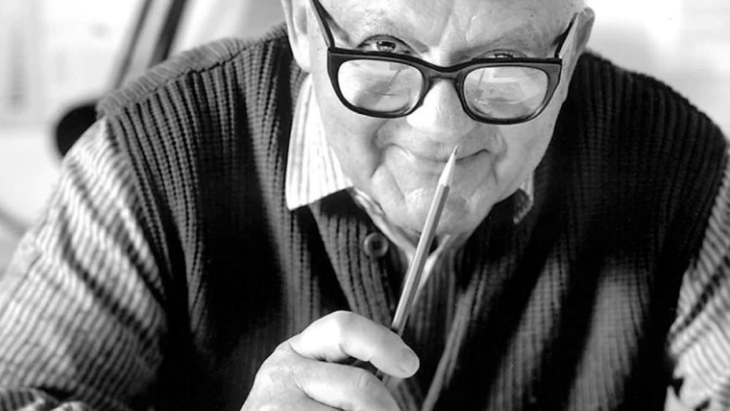
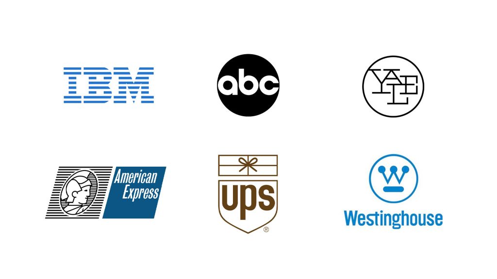
At the time, Paul Rand was a renowned designer with an impressive portfolio that included brands such as IBM, Westinghouse, ABC and UPS. His philosophy was that a logo should be not only beautiful, but also functional. Throughout his career, Rand’s work displayed the quality of simplicity. He was one of the first American designers to incorporate the Swiss Style of graphic design, with a less is more approach.
Ideally, a logo should “explain or suggest the business it symbolises”.
Paul Rand
Rand didn’t normally work for startups, however, he believed in Jobs ideas. So, when Jobs approached him asking for a logo, Rand accepted.
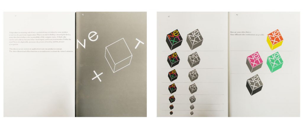
The problem Rand was tasked with was to create a logo that would identify the company without requiring the company name always attached alongside. Without spending “10 years and $100mil”, Jobs wanted the NeXT logo to be an instantly recognisable “jewel” that sat on the product and marketing material. Knowing the product would be housed in a black cube and the brand name, Rand got to work on designing the logo.
“What is essential is finding a meaningful device, some idea—preferably product-related—that reinforces the company name.
Paul Rand
The Logo
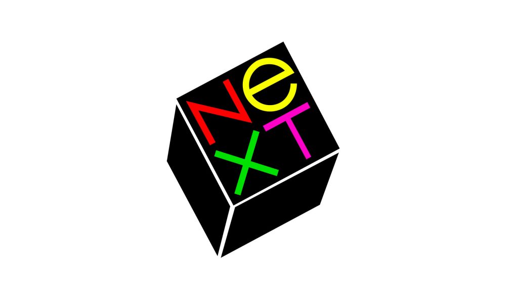
The NeXT logo is, essentially, an emblem style logo, occurring in one instance and only changing in scale.
The cube, in which the computer will be housed, can be such a device because it has visual impact, and is easy to remember. Unlike the word Next, it is depictable, possesses the promise of meaning and pleasure of recognition.”
Paul Rand
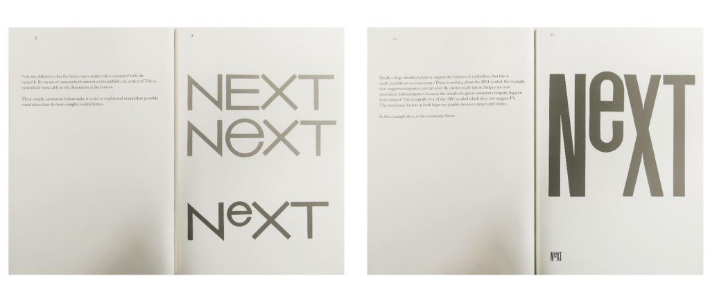
Originally NEXT, Rand explains that the capitalisation of all letters could cause confusion between NEXT and EXIT, due to the EXT combination. To alleviate this problem, a combination of lowercase and uppercase letters are used.
The de-capitalised ‘e’ provides a “focal point and visual contrast against the capital letters”, all of which use straight lines. The sans serif style typeface was chosen for its ability to exploit and manipulate possible visual ideas.
Presenting The Logo
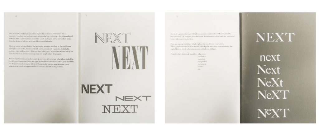
Rand was known for presenting his designs in a presentation booklet that walked the reader through the thought process and meaning behind his design. Throughout the 100-page book Rand presented to Jobs, he explains the steps he took and the reasons behind the choices he made to arrive at the final logo.
Rand starts by presenting a range of typeface options to show how the word would look in each. He explains how his decision to de-capitalise the ‘e’ was not simply to reduce confusion, but that the ‘e’ could also stand for education, excellence, expertise, exceptional, excitement and e=mc². By placing the word NeXT within the black cube, Rand was able to avoid the need for a symbol and a wordmark.
The Presentation Booklet
Now, remember that Jobs’ initial wish for the design was that it would be a “jewel” that would associate the brand with the product in a short space of time. Rand decided to use a black cube to reinforce the memorability of the brand. It also works well as the product itself, the computer, is a black cube.
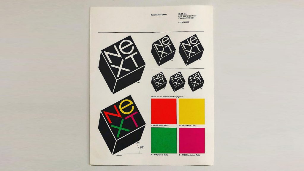
The choice of brilliant colours against a black background were designed to appeal to a youthful audience and to “add a sparkling jewel-like touch”. Using yellow for the ‘e’ again draws your attention to the letter, emphasising it as a focal point. Angling the logo at 28 degrees was purposeful to increase its appeal to a youthful audience.
Tipped at a jaunty angle, it brims with the informality, friendliness, and spontaneity of a Christmas seal and the authority of a rubber stamp.
Paul Rand
The end result is a striking emblem logo that successfully identifies the product with the brand in a playful way.
This idea in no way restricts its application to any one product or concept. The three-dimensional effect functions as an underscore to attract the viewer’s attention.
Paul Rand
What do I think of this logo?
The use of an emblem logo for this product was a stroke of genius. In the right context, I think emblem logos can be some of the best. They are very practical and functional in all media environments. The aim of this logo was to quickly associate the product with the brand and Rand has done this quite successfully.
Not only did he think about how he can associate the brand and the product, he also thought about how the logo would work as a marketing tool. Rand saw the benefits of how such a logo could work in merchandising and in professional presentation environments. It’s not easy to convey the nature of a product or business in a single logo, but Rand has managed to do this well.
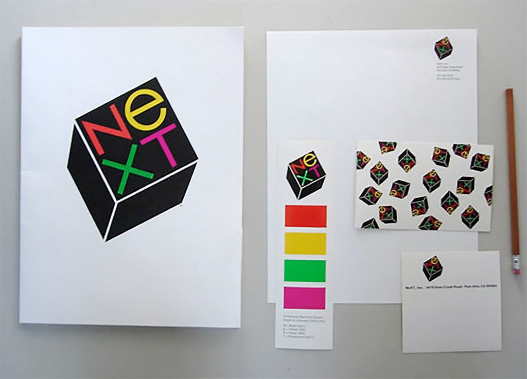
The adaptation of this device for miniaturization, for tie tacks, charm bracelets, paper weights, stickers, and other promotional items is endless. It lends itself as well to large-scale interpretation—signs, exhibits in the shape of cubes, in which the actual exhibit is housed, as well as exhibit stands. For printed matter, its infinite adaptability and attention-compelling power is self-evident.
Paul Rand
What can we learn?
One of the main takeaways from this story is the approach Rand took to present the logo. Designers can thrive on mystery and ambiguity. Some believe that their creativity is defined by their ability to simply think of a good idea. Rand, on the other hand, wanted to tell a story. He wanted to take the client on a journey of the design process he used to achieve the final product. He did this with a carefully orchestrated and detailed booklet.
Upon seeing the final logo, the reader’s reaction would be based on rational understanding rather than personal taste. When presenting logos, consider utilising this approach. It’s a useful technique to outline the rationale behind the design, helping the client understand why the logo looks the way it does.
You may also wish to consider the use of emblem marks more in your designs. Think of the context of the logo and how it will be used. We often see combination marks and wordmarks used as they can be quite effective at identifying the brand. However, as combination marks can be used in a myriad of ways, this can sometimes present more questions than answers. Perhaps taking a leaf from Rand’s book and thinking of a simpler method is the right way for your design.
Emblem logos can kill two birds with one stone by creating an all encompassing logo that is always seen in one instance. Whilst this works for many logos, such as NeXT, Starbucks and Warner Brothers, it should not be a go-to solution. Emblem logos can lack creative scope due to their all-in-one nature. So, think about the context of your design and how you can present your thinking to the client to help them understand how you got to the end result.
1993 interview re: Paul Rand and Steve Jobs
See more of Pauls Rand’s work on his NeXT logo here
So what are your thoughts on the logo? Do you like how Rand approached it? Would you have approached it differently? Let me know in the comments below and don’t forget to check out our other logo reviews!