


There are many logos today that look vastly different from their original. Think of Pepsi, whose current logo is worlds away from their original. Then, there are logos that have remained fairly unchanged. The Subway logo is one such logo.
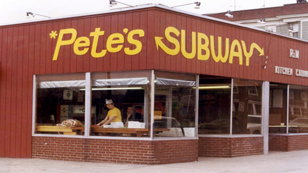
Opening in 1965 as Pete’s Subway, the iconic yellow colouring and arrow tails on the S and Y were already apparent. In 1969, the brand name was shortened to simply, Subway. During this rebrand as the company rapidly grew, the brand colours changed from a simple golden yellow, to incorporate green, white and yellow, reflecting the ingredients used within Subway’s sandwiches.
This colour combination was, and still is, vastly different from many popular fast food chains, who tend to stick to reds, yellows and oranges. The green is synonymous with freshness and health, while the yellow represents positivity. The arrows, which have remained throughout the entirety of the logo’s evolution, represent the variety of choices the customer has when ordering at Subway.
Changing with the times
This logo remained as the company continued to grow, eventually becoming a worldwide brand that was considered a healthier fast food option. In 2002, the logo had its biggest update yet. Whilst the colour palette remained unchanged, the logotype became more rigid and italicised. The green oval was removed and replaced with a bold green border. Although it was a bold step for Subway, very little had really changed. The brand had simply updated to fit with modern trends, which didn’t include backgrounds and round text. From 2002 to 2015 this was the logo we saw on Subway stores, adverts, packaging and online.
Then, in line with the Rio Olympics in 2016, Subway underwent its biggest rebrand again. This time, the brand had a new wordmark and logomark. Turner Duckworth, the agency behind this rebrand, looked for inspiration from the company’s history to reinvent Subways future visual identity.
The Logo
The Subway logo is a wordmark logo that uses a bold sans serif typeface in capital letters. The new green, yellow and white ‘S’ is a logomark that cleverly uses negative space and the iconic Subway arrows.
The colour palette has been refreshed to use a more vibrant green and more golden yellow. Removing white as a main component, the yellow colour is now used for the SUB instead of the WAY of the logo. This harks back to the colour of the original logo, aligning with the arrow pointing backwards, to indicate a look at the past. The WAY half of the logo is now green, with the forward arrow indicating a green future for the brand.
The logotype has also had a dramatic change. However, instead of completely reinventing the brand and creating a brand new logotype, the rebrand looks remarkably similar to the 1968 logo. The differences are very subtle, with a less exaggerated S and Y than the 1968 version, instead incorporating a more consistent style with the rest of the logomark. The other obvious alteration is the removal of a border or background. This simplifies the logo further as the change in colours no longer require the use of a border for legibility.
2016 brand showcase
Video source: TurnerDuckworth
The biggest thing to come from this rebrand is the symbol of the two arrows. This is a very clever use of the iconic and timeless arrows and has been used in such a way that they not only create a large abstract S, but also create a smaller white S with the negative space between the two arrows. This logomark has changed Subway’s branding in a way that previously couldn’t be done.
For such a well-known brand, Subway has always used it’s full wordmark logo as its main branding. The addition of this logomark allows Subway to use a shorter, simpler and, some may argue, more creative and impactful style of branding. The yellow and green arrows are so much associated with Subway now that the full use of the wordmark is no longer needed.
The rebrand not only celebrates a new Subway while harking back to its roots, but also the fresh ingredients and variety offered to customers.
As Turner Duckworth says, the logomark is “a symbol that empowers customers to enjoy Subway in any way they choose”.
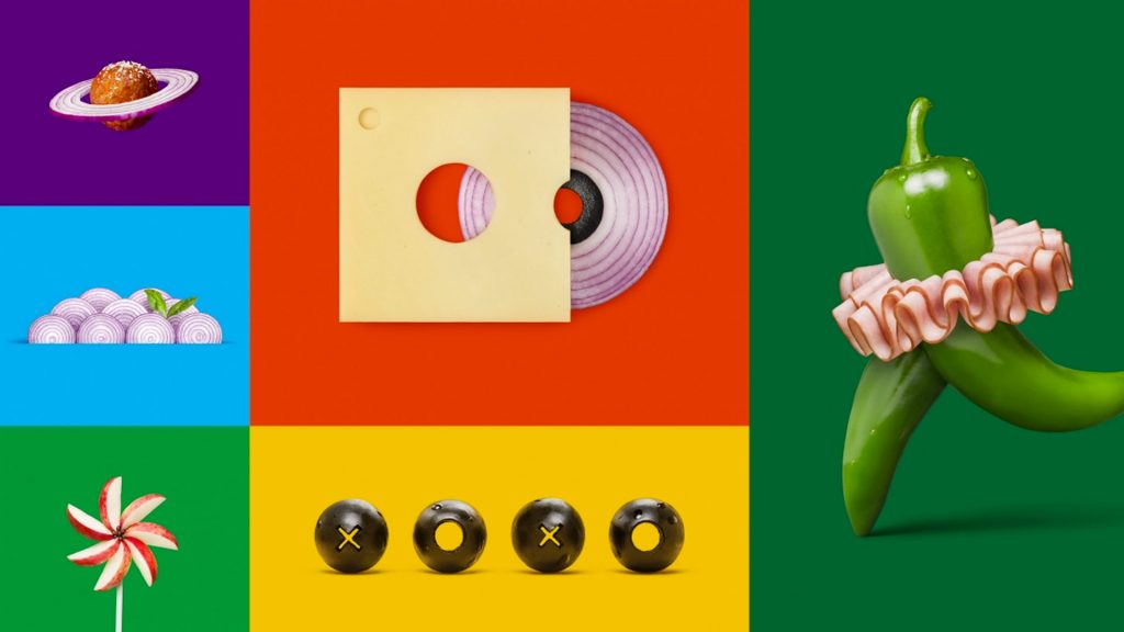
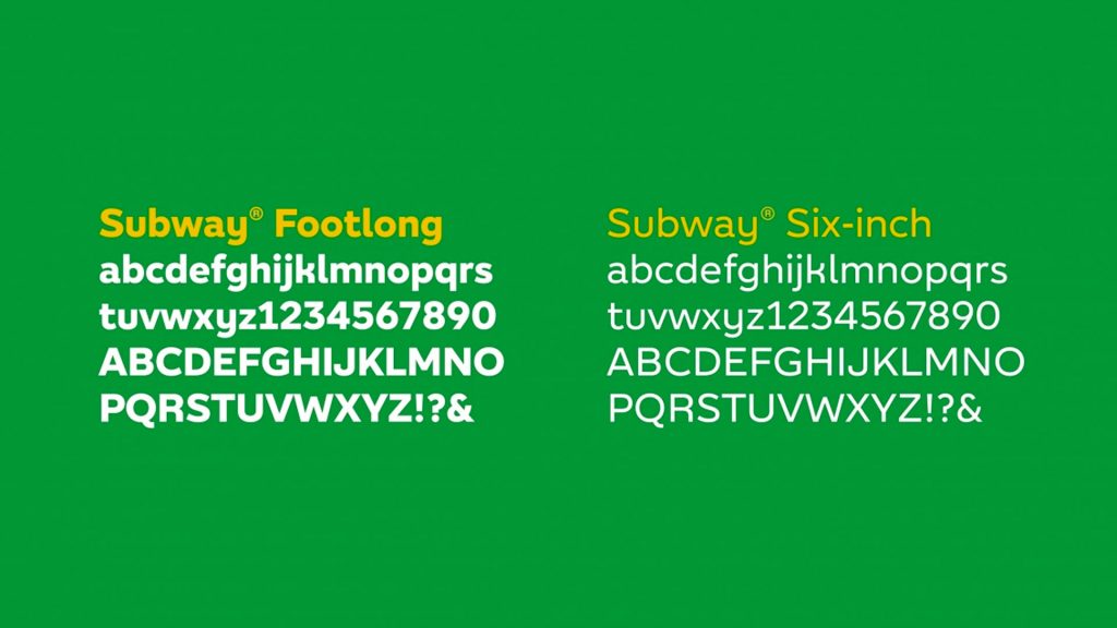
Fresh or toasted? Six inch or footlong? Eat in or takeaway? The logomark is used in such a way that suggests a this-or-that option when eating at Subway. The broad new use of colours in the extended branding is a celebration of the variety of ingredients used within Subway sandwiches and salads. The rebrand has even gone to the extent to creatively play on the weight of the typeface for footlong and six-inch subs, with footlongs using a bold typeface, or twice the size of the six-inch typeface.
What do I think of this logo?
The 2016 brand refresh is a good example of how you don’t have to completely change your image. The new brand identity does well to celebrate Subway’s history whilst looking to its future. When we think of logo re-brand designs like Pepsi in 2008 we can see how it can take away something that was once truly iconic.
This is a perfect example of how a brand refresh/re-design doesn’t have to mean completely reimagining the design. There is beauty in simplicity and sometimes, you just get it right the first time. The simplification of the logo while keeping its roots and distinction is genius with their new logo mark and their use of negative space to depict the letter ‘S’.
There is something extremely refreshing about a brand that does not change for the sake of change. Subway has a strong brand image and it will remain strong. This is a brand that is confident in an image they have spent decades establishing and respects the relationship that people have made with it. Brands should keep this in mind for future brand refreshes.
What can we learn?
The next time you’re working on a new logo, perhaps look at the brand’s history to see how you can pay homage to where it’s come from. Also, consider the context of the brand. Are they now established like Subway and therefore able to make a bold move with a minimalist logomark? Or is the brand still in its infancy and requiring some assistance in recognition? Think of the way you use colours and the extended branding. What do your colour choices say about the brand?
Consider the brands goals and how they wish to be viewed. When Steve Jobs was looking for a logo for his brand NeXT, he said he didn’t want to spend 10 years and $100mil teaching customers to associate his product to his brand. He wanted the logo to do it all relatively quickly. Subway has gone a different route and whilst it has represented its product within its logo, it’s taken many years for the brand to get to a point where it no longer requires the full use of its wordmark. Does your logo need to quickly associate the product and brand for the consumer? Or is the brand in it for the long game and willing to strive for longevity over quick satisfaction? Always remember context in your design and consider which approach is best for the brand.
See the full 2016 redesign on the Turnerduckworth website here
Liked this Logo review? See more like this here