In a world of overnight shipping and same-day delivery, it’s hard to imagine waiting weeks for an order to arrive. These days you can order from anywhere in the world and have it with you in less than a week. How far technology has come in just 50 years!
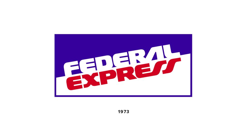
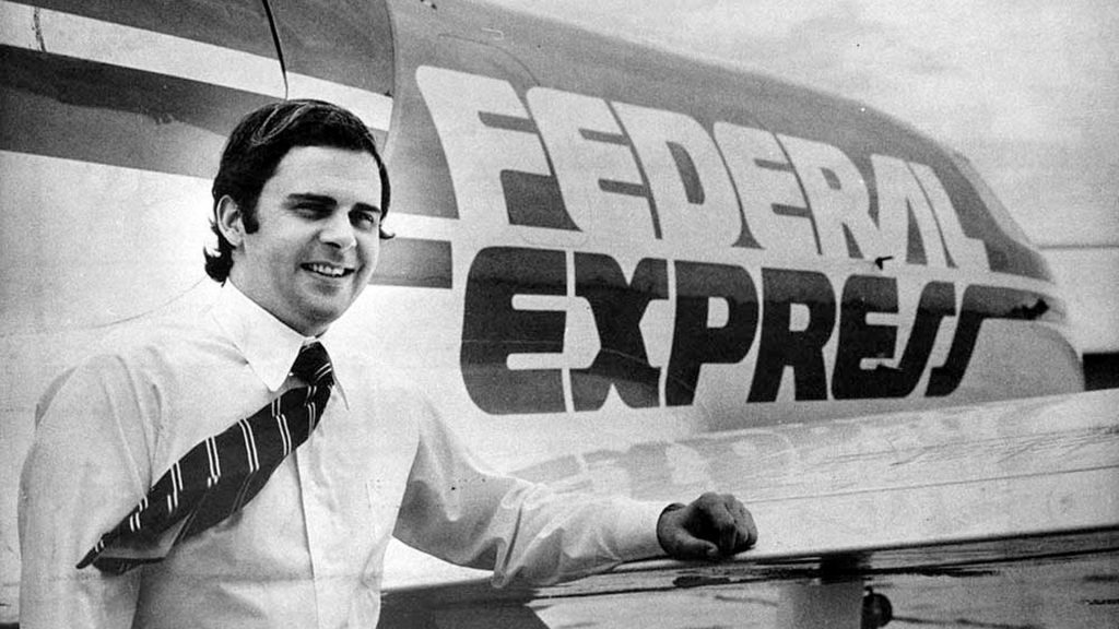
In 1965, Fred Smith, a Yale student, recognised the need for a more streamlined way of delivering time-sensitive shipments such as medicine, computer parts, and electronics. At the time, most air freight shippers relied on passenger routes for delivery. This just didn’t make logistical sense to Smith. So, in 1971, Smith bought into the aviation industry. After developing a brand and establishing company headquarters, Federal Express officially began its operations in 1973.
What’s in a name?
Smith decided on the name Federal Express for the patriotic association of the word “federal”. It suggested an interest in nationwide economic activity and expressed the extent of the company’s delivering capabilities. “Express” told the customer their package would be delivered in a speedy manner. Therefore, Federal Express would be known as a nationwide express postage service. Smith also had the Federal Reserve Bank in mind as a potential customer, however the bank denied his proposal. Despite this, he decided to keep the name as it was memorable and would attract the attention of the public. So the name stayed.
As the company grew, so did it’s delivery destinations. In 1984, Federal Express went global as it began a regular scheduled flight to Europe. In 1989 it became the world’s largest full service, all cargo airline. By 1991, Federal Express had become a household name. With such a long name, it became colloquially known as FedEx by almost everyone using its services. Because of this, the company decided to use a shortened version of their main logo; a blue “FED” and red “EX”.
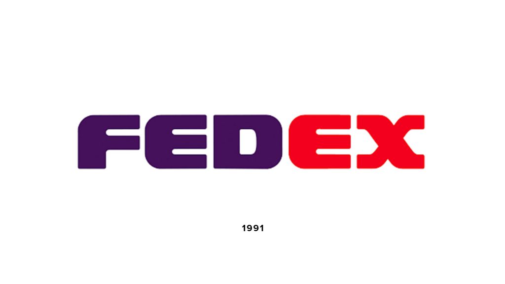
Although well known, many customers still thought the brand mainly offered an overnight service within the US. So with the global expansion of its operations and its full-service capabilities, it was time for a rebrand.
Lindon Leader

Whilst he runs his own firm now, Leader Creative, back in 1994, Lindon Leader was the Senior Design Director of Landor Associates. Leader’s goal for the FedEx logo was to clearly convey Federal Express’s services and scope to its customers.
“Customers had come to say ‘FedEx a package’ even when they were using other shippers. So the process of express shipping had become generic. We advised them that the company needed to leverage its most valuable asset, and that is the FedEx brand.”
Lindon Leader
Hundreds of designs were narrowed down to just a handful. Each used the same colour scheme, but accentuated white as the dominant colour.
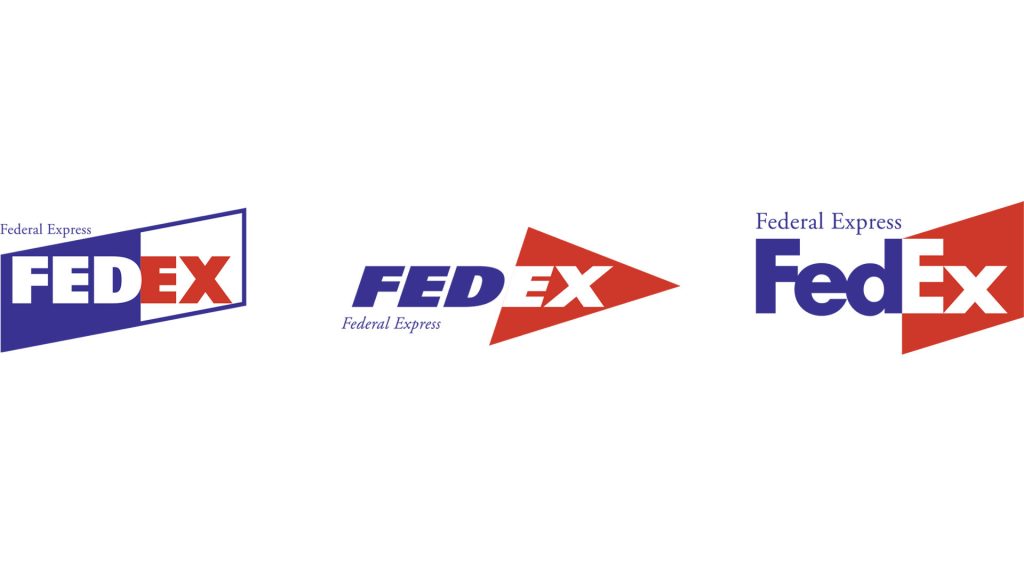
“Each of the five candidates did pretty much what the current identity is doing. They maximised the impact of the identity, whilst also maximising the colour white. It’s on their envelopes, it’s on their vehicles, it’s on their aircraft because white is traditionally associated with Federal Express.”
Lindon Leader
Leader’s well-known philosophy is simplicity and clarity. The recipient of more than 30 prestigious design awards worldwide, Leader has worked with leading global brands, including Hawaiian Airlines, Alsco, Addison, Disney and Motorola. However, of all his logo designs, the FedEx logo is one of his most famous.
“I strive for two things in design: simplicity and clarity. Great design is born of those two things.”
Lindon Leader
The problem facing Leader was to help communicate the breadth of Federal Expresses services to its new and existing customers. To do this, Federal Express was advised to leverage one of its most valuable assets—the FedEx brand. By officially shortening its name from Federal Express to simply FedEx, not only would the idea that the company only offered nationwide services be removed, but it also disassociated with negative connotations of the word “federal”, e.g. Federal Republic of Germany and Federalists in Latin America. So, the FedEx brand was officially born.
With the shortening of the name, the next challenge was to design a logo that represented the brands global scope and services.
The Logo
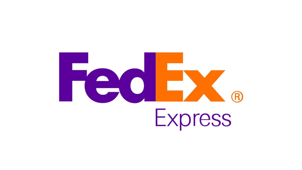
The FedEx logo is essentially a logotype / wordmark logo. Leader studied both Univers 67 (Bold Condensed) and Futura Bold typefaces as potential contenders for the new logo design. Whilst he liked both typefaces, each had its own limitations.
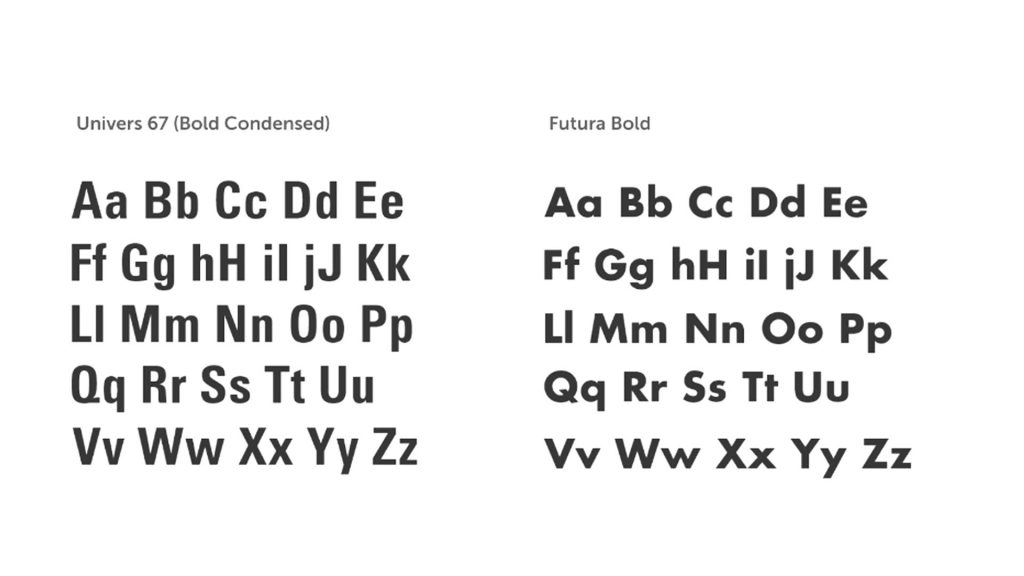
“I was studying Univers 67 (Bold Condensed) and Futura Bold, both wonderful faces.
Lindon Leader
But each had its potential limitations. Neither was particularly suited to forcing an arrow into its assigned parking place without torturing the beautifully crafted letterforms of the respective faces.
I took the best characteristics of both and combined them into unique and proprietary letterforms that included both ligatures (connected letters) and a higher x-height, or increased size of the lower-case letters relative to the capital letters.
I worked these features around until the arrow seemed quite natural in shape and location.
So, Leader used the best aspects from each typeface to create a bespoke typeface for FedEx. The combination of ligatures (connected letters), a higher x-height and increased size of the lower-case letters relative to the capital letters did this perfectly. Several potential logos were presented, but the final wordmark consisted of a capital “F” and “E”, with the remaining letters all lower-case. It’s the combination of the capital “E” and lowercase “x” in the “Ex” where the true magic of this logo happens.

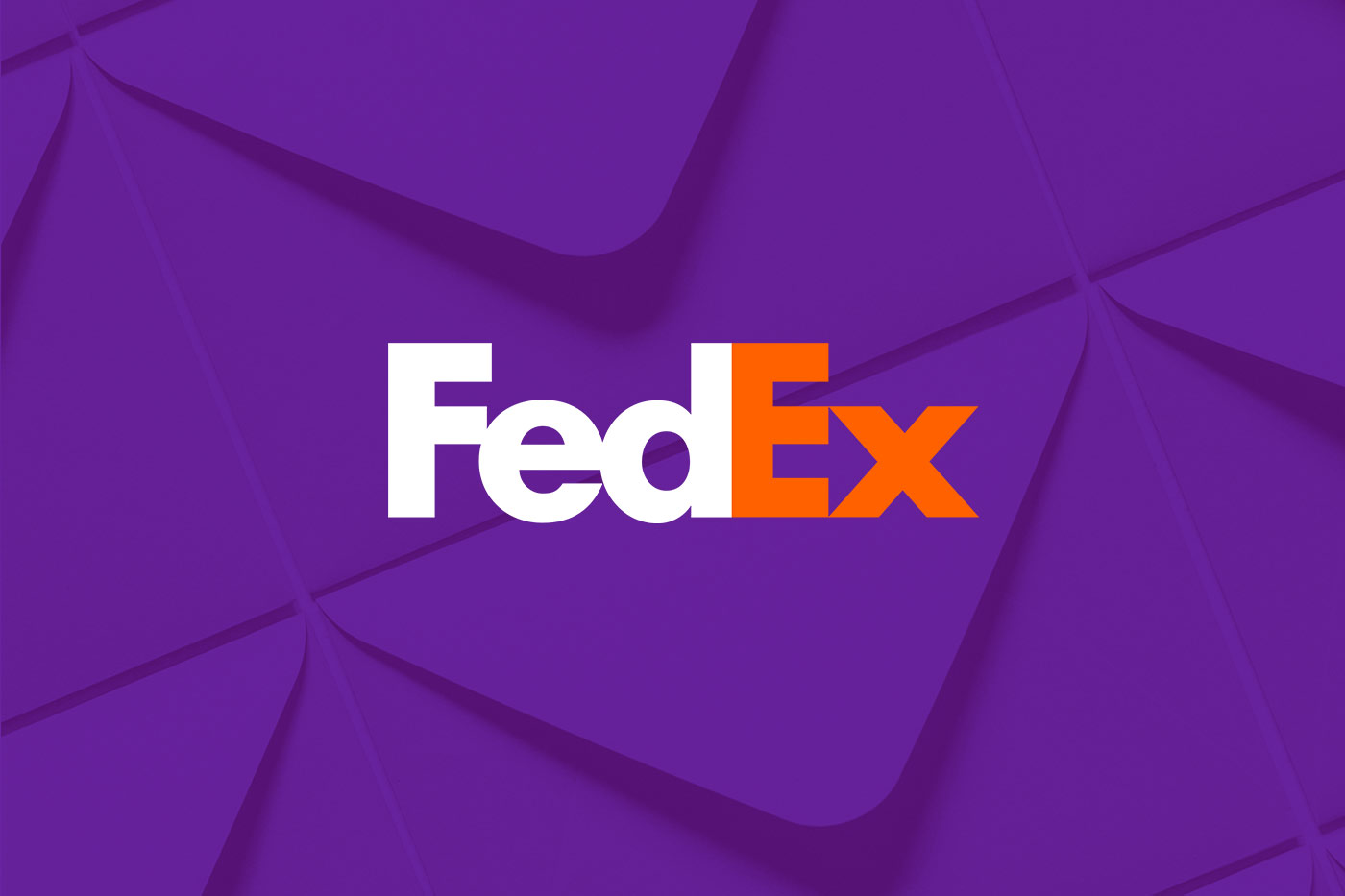
If you focus solely on the letters you probably won’t notice it. Take a look at the white (negative) space between the letters. Here you can see a subtle white arrow sitting perfectly between the “E” and “x”. Millions of customers, and even most people who were initially present with the logo, miss the arrow in the logo. This arrow represents speed, a forward-moving direction, accuracy and thought.

Colour Palette
The original colour scheme of red, white and blue was chosen for their patriotic ties and individual qualities of strength (red) and professionalism (blue). During the rebrand, the colour palette was changed to a royal violet and orange. The royal violet signifies the high-quality service of the brand, while the orange represents optimism and energy, qualities that communicate FedEx’s forward-moving attitude.
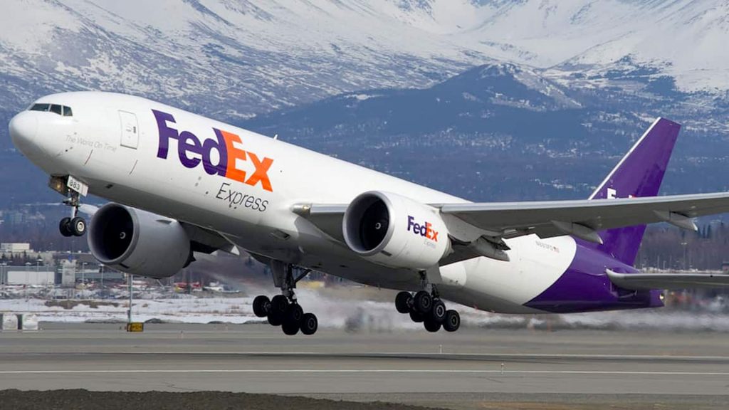
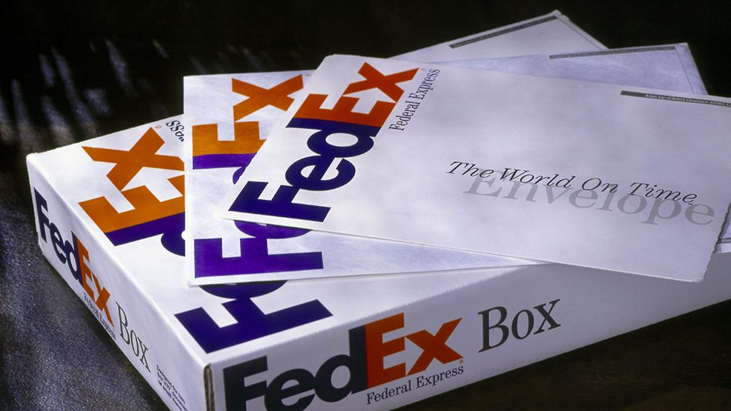
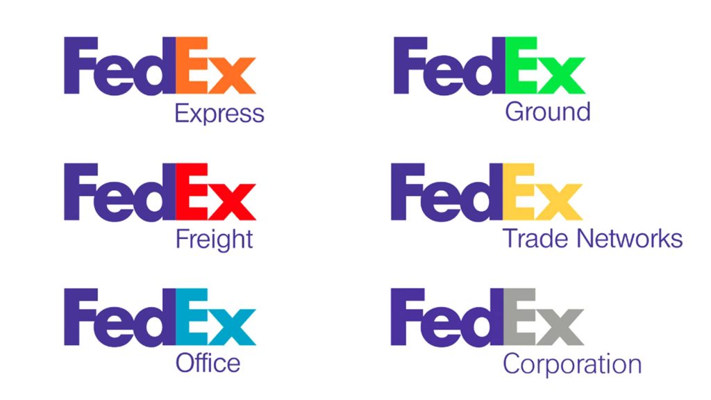
This new logo system allows the brands application on a range of media, from envelopes, paper packaging and drop-boxes, to aircraft, delivery vans and uniforms. The logo has remained unchanged since its design in 1994, except where the business has expanded further. The expansion of the brands colour palette helps customers identify different FedEx services available, such as orange for Express, green for Ground and red for Freight.
What can we learn?
As one of the most popular logos ever design, the FedEx logo has won over 40 design awards and remains popular amongst designers. Many design schools use the logo to show how to use negative space effectively in logo design.
When designing a logo for a brand that wants a powerful message communicated, it can sometimes seem logical to make the message as obvious and clear to the customer as possible. Of course, we want the customer to understand the brand’s values and intentions, but as graphic designers we want to do so in a way that is creative and visually appealing.
To express the nature of a product or business quite literally in a logo can come across as cliche. However, if done well, the logo can be both simple and clear whilst communicating the required message. The FedEx logo is a prime example of how to use simplicity and clarity in a logo whilst including a little artistic flair. Most people won’t notice the subtle use of negative space. However, upon seeing the white arrow it’s hard not to think “ah, that’s clever!”.
A logo design is ultimately visual communication. There is typically only a small space and one instance to communicate a message. With clever use of negative space and visual elements, if executed well, the subliminal logo can communicate more with less, often expressing few complex messages. When developing a logo design, keep in mind the qualities that subliminal messaging can add to your logo design and how powerful the use of negative space can be.
What do I think?
The FedEx Logo is a prime example of superb ubiquity and inspiring symbolism. Widely regarded as one of the greatest logos ever designed, it has won many prestigious design awards.
Very simple and memorable.
Liked this logo review? See more like this here


