

As graphic designers, we’re used to creating logos for brands, most of which are corporate. But what if the client isn’t corporate? What if they’re an art gallery? How do you go about designing for a client whose brand is art? How can you design a logo that represents something as diverse and subjective as art? This is the exact problem Marina Willer, Creative Director of Wolff Olins, found herself facing in 1999 when she was tasked with designing a new logo for the Tate brand.
Marina Willer

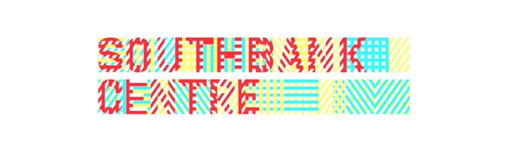
In preparation for the opening of their new building, Tate Modern, in London in 2000, Tate commissioned Wolff Olins to create their new logo. Leading the team was Marina Willer, Creative Director, Graphic Designer and Film Maker with a Masters from the Royal College of Art. She has won awards for both her design and film making work. Willer is known for leading teams at Wolff Olins on brand identities for Beeline, Southbank Centre and Oxfam, to name a few.
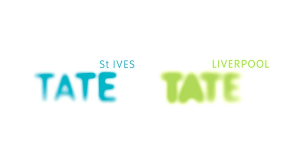
Tate wanted the logo to link the four galleries in London, St. Ives and Liverpool, whilst still maintaining and celebrating their individual nature. Willer devised a theme for the brand; ‘look again, think again’. The idea behind this theme was that art makes you constantly challenge yourself and helps you see the world in a different way. Art is not fixed. It is subjective. Everyone experiences art differently, so the identity for the brand had to reflect this.
“The way that started to translate into visuals was to think of Tate as something that is always changing, but is always Tate,”
Marina Willer
The Logo
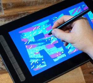
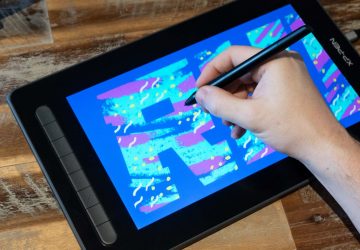
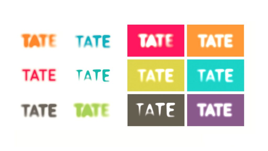
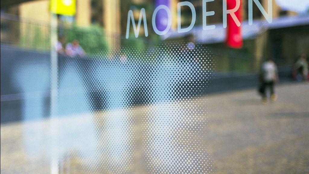
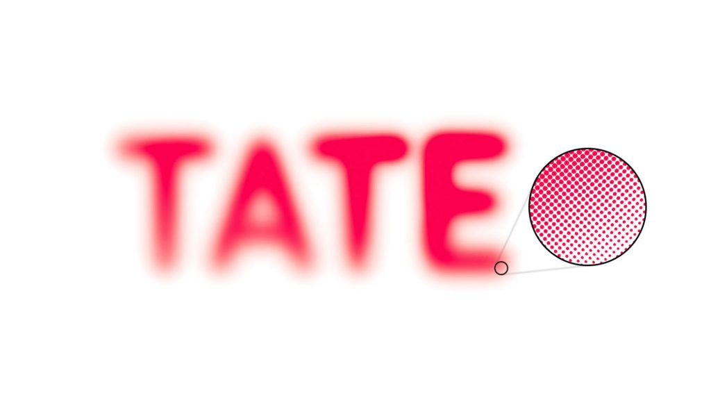
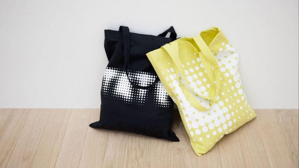
The Tate logo is essentially a wordmark containing around 3,000+ dots, with a blur effect applied.

As this logo was to be different to a traditional logo, the method Miller used was also unorthodox. The logo wasn’t created on a computer, but rather through various art mediums. This method could, in itself, be considered an installation within the gallery it represented. Each day, Miller drew a different ‘TATE’ and projected it, like an art installation.
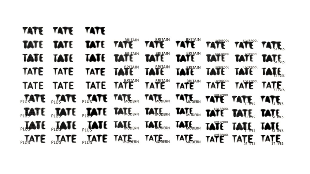
She then photographed and animated the projections to create a fluid, ever-changing logo. She then took screen grabs of the changing logo, resulting in 75 slightly different variations of the word ‘TATE’. Each version was essentially the same, part of a family, but with varying degrees of intensity. This became the final logomark; a family of varying logos that could all be used.
“We designed a range of logos that move in and out of focus, suggesting the dynamic nature of Tate – always changing but always recognizable.”
Wolff Olins
No Rules!
The fluidity and ever changing nature of the logo reflected the ever changing nature of Tate. Miller used around 3,000 dots to create the logo, creating a blur effect. This removed any rigidity from the design and emphasised the idea of movement. The fact that the logo is blurry plays on your mind and causes you to look at it for longer than you may look at other logos. The idea is that sometimes art is not immediately clear and you need to focus on it for a while to understand it. The blur effect also works well to draw focus to the superscript identification for each individual gallery. The eye is naturally drawn to the words in focus, shifting the blurred words to the background. This plays on the idea that each gallery has its own identity and characteristics, but is ultimately all part of one family.
To continue the theme of art in the logo, there were no rules. Designers could use any version of the logo they liked at any of the sites at any one time. Whilst the idea of this reflects the nature of the brand brilliantly, it fell short in the application. Designers didn’t like to play with many different styles and would often choose a version they liked and stick with it. This lack of guidance in the application made the process a little chaotic and caused some issues within the organisation.
Another Rebrand
The Tate logo is essentially a wordmark containing around 3,000+ dots, with a blur effect applied.
The blurry logo system served until 2016 when Tate decided it was time for another rebrand. They called on London-based design agency North to design a simpler and fresher logo. Instead of scrapping the original idea, North saw the creative genius in Miller’s design and decided to continue with the same idea, but simplified it.
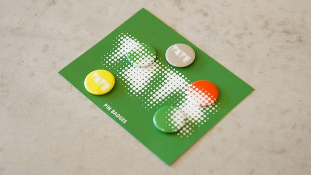
North took the 75 logo variations made from 3,000+ dots and condensed them into one single logo consisting of just 340 odd dots.
This new logo kept the spirit of the original logo but made it easier for creative teams to apply across merchandise and marketing. To audiences familiar with the Tate brand, the logo hasn’t changed all that much. It’s simpler, but still has the essence they’ve always known Tate to have. For new audiences, the new logo is even blurrier than the originals, forcing new audiences to hold their focus on the logo for some time to read the word ‘TATE’. Although ahead of its time, this creative method of logo design has influenced other brands to further explore their creativity in their branding.
What do I think of this logo?
One of the things I love most about this logo system is how it challenged common design rules. Traditionally, it was believed that recurring images were the best and only way to build strong brand recognition. Using not one, but 75 different logo variations created a rich and dynamic brand identity and redefined how designers think about branding.
This logo system helps redefine what a logo can be. No longer is a logo subject to rigid lines and repetition. In true art spirit, this logo saw the rules and broke them. Trust an art gallery to be the brand that challenges the status quo of design.
What can we learn?
Design is not simple, nor is it constant. Design is ever-changing, which is part of its beauty. Just because it’s always been done a certain way doesn’t mean it should always be done this way. This logo challenged common design rules and there is no reason you can’t too. However, bear in mind that whilst the idea behind the logo is a stroke of creative genius, sometimes rules are necessary.
As interesting, creative and quirky a logo system can be in theory, having multiple versions of a logo can be difficult to apply. Think about your idea and ask yourself, is the application practical? Remember that graphic design is not an art contest. The goal of a graphic designer is to solve a problem and create visual solutions. If it fits with the brand to challenge the status quo and you’re able to incorporate some artistic flair, by all means go ahead. But remember to consider the people who will be applying your design. If it’s too complicated, how can you alter it so your design idea is easier to implement?
So what are your thoughts on the logo? Do you like how Willer approached it? Would you have approached it differently? Let me know in the comments below and don’t forget to check out our other logo reviews!