


If you were to name the top 5 car manufacturers, who would you name? I can’t say all 5 for certain, but I’m sure Toyota would be in your list. This global car manufacturer has become so iconic that simply seeing the three ellipses logo brings Toyota to mind. But did you know that Toyota wasn’t always called Toyota? It also didn’t always manufacture cars. And have you ever wondered what the logo actually means?

Firstly, let’s go back to Toyota’s origins. Back in the early 1930’s, Kiichiro Toyoda decided to transform his father’s loom and textile company into an automobile manufacturer. Yes, Toyota was originally Toyoda. Then, in 1936, the company ran a competition to design the new logo. From this competition came not just a new logo, but also a new name. Instead of Toyoda, the company would now be known as Toyota. But why this change?

There are many suggestions as to the reasons behind this name change. The most commonly attributed reason is that the winning logo was written in Japanese katakana which, when spelled “Toyoda”, uses ten strokes. Alternatively, when you change the word to “Toyota”, it only uses eight strokes. In Japanese culture, eight is considered a “good number” and therefore is suitable to use in business. So, “Toyota” was born!
This logo remained with the company for many years as it grew, until 1989 when it was changed to commemorate the brand’s 50th anniversary. This change was mainly due to Toyota’s expansion into the European market, identifying a need to cater to a European audience.

So, what does it mean?
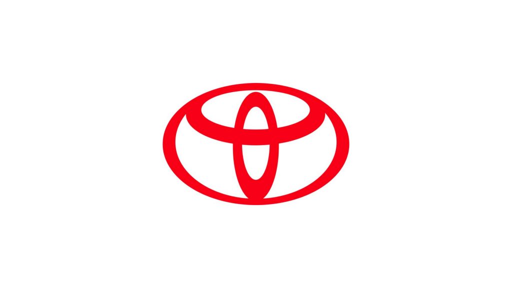
This is the logo that springs to mind for many of us when we think of Toyota. But, have you ever wondered what the ovals mean? Some people say it looks like a bull, for some it’s a cowboy in a big hat!
Some people have also analysed the logo to include a secret message. No, it’s not just a bunch of ellipses overlapping. Whether intentionally or not – and with a little creative imagination – the circles can create the letters of the word “toyota”.
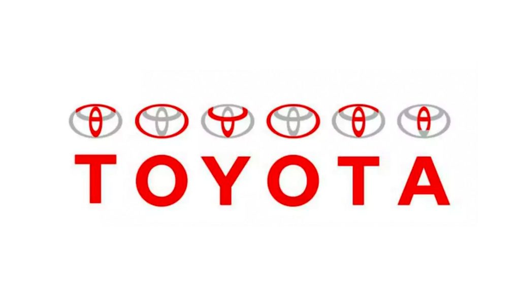
Some have also suggested that the perpendicular ellipses are reminiscent of a needle being threaded, paying homage to Toyota’s origins as a looms and textiles company. Thankfully, to stop us all from guessing what it could mean, Toyota tells us exactly what their logo means.
The True Meaning
According to the Toyota website, the three overlapping ellipses symbolise “the unification of the hearts of [their] customers and the heart of Toyota products”. This suggests Toyota’s goals and values align with their customers. A good goal for a business wishing to succeed, to have its customers at its heart.
“The inner ovals symbolise the heart of the customer and the heart of the company, overlapping to represent a mutually beneficial relationship and trust between the two, as well as forming a ‘T’ shape for Toyota. The outer oval one signifies the world embracing Toyota.”
Toyota claims that the background space “represents [their] technological advancement and the boundless opportunities ahead”. They’ve also acknowledged that the two perpendicular ellipses create a “T” to symbolise Toyota, but they’ve not confirmed or denied the inclusion of the other letters in the logo.
You’ll also notice the strokes vary in thickness. This is also by design. The strokes are reminiscent of Japanese calligraphy with its fluid motion and varying stroke weights. It’s as though, as with Japanese calligraphy, the logo has been painted with a beautiful brush.
Toyota has done well to establish an instantly recognisable logo for a global market, whilst still paying respect to its Japanese roots.
The Logo
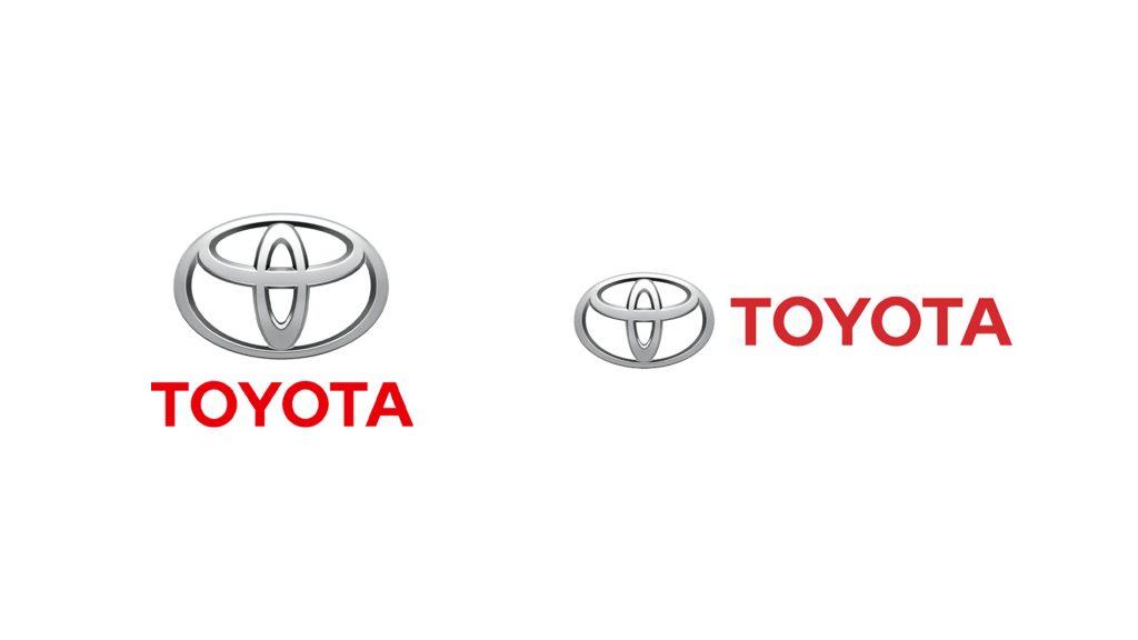
In 1989 Toyota introduced the logos as we are familiar with today. The logo is essentially a combination mark commonly seen stacked vertically, though it is also used in its horizontal composition.
The logomark features a skeuomorphic effect to mimic the metallic aesthetic of the physical logo seen on its vehicles.
The wordmark is a bold sans serif typeface in all caps. The wordmark is most commonly used in red; a common colour used in Japan that symbolises prosperity.
Another clever feature of this logo is its symmetry. This allows the logo to not only be visible head on, but also in a rear-view mirror, so the logo is always visible in its fullest. This level of detail demonstrates the intricate and precise nature of the brand and its design.
Simplifying The Logo
You’ve probably noticed a fair few companies, car companies in particular, have recently changed their logo from 3D to 2D. Toyota has also recently undergone a “flattening” of their famous logo. While some say it’s a trend to align with other industries who have undergone a similar change – think social media platforms simplifying their logos – I disagree.
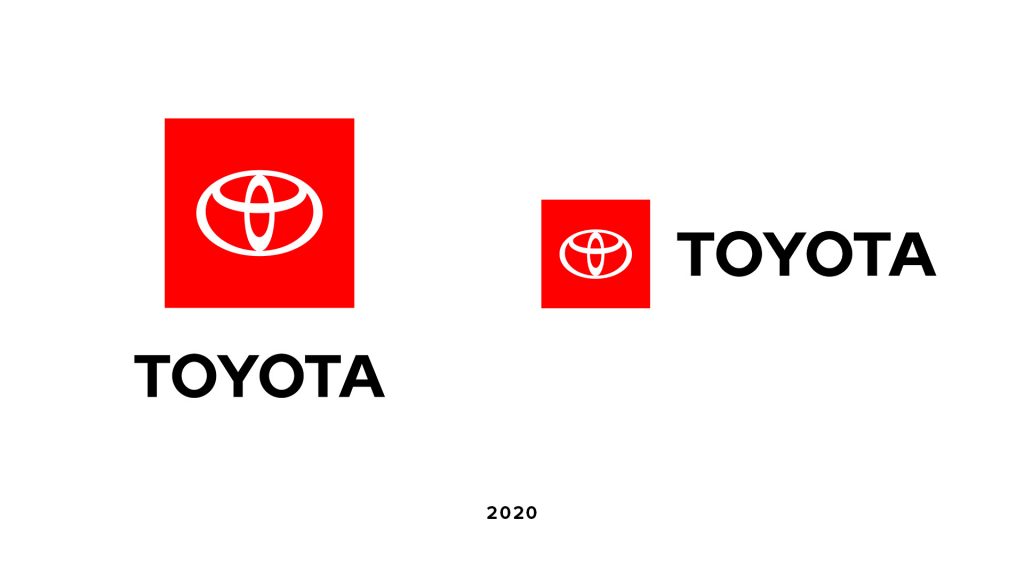
At a glance the silhouette of the logo remains the same. However, the refresh has moved away from both the rigid combination mark lockup and the metallic skeuomorphic effect, to become more refined and simplified. The logo is also more flexible as it is used separately, instead of always being seen together.

The&Partnership
London-based creative agency The&Partnership have been working with Toyota for a number of years now on various creative campaigns. So, when Toyota decided it was time to modernise their logo, it was The&Partnership who were to update it.
As mentioned, many car brands have decided to “flatten” their previously 3D logos, so you may think Toyota has simply jumped on the bandwagon of an industry trend. Head of Art at The&Partnership, Dan Beckett, however, disagrees. He doesn’t consider this new style of logos in the car industry to be a trend, but rather a way of keeping up with technology.
“I don’t see it as a new trend. I see it as the logical solution to a universal problem created by a different trend. It’s just more car brands got on that first bandwagon.”
Dan Beckett
As our lives become based progressively more online, it’s important for brands to keep up with how their customers are interacting with them. Toyota’s main communication with its customers, as with many car brands, used to be face-to-face or in print. People would come into a showroom to see a physical car to decide if it’s what they wanted to purchase.
Modern Design
Nowadays, people will still go into a showroom to view a car, but they’re more likely to visit Toyota’s website or see an ad on TV or online before doing so. This change in the way we interact with brands has been the key driver to many car brands simplifying their logos. This is why Dan Beckett doesn’t consider this change a trend, but rather a modernisation.
The four-point brief presented to The&Partnership was to be forward-thinking, grant the company a more “premium” feel, prioritise mobile display, and offer consistency across all parts of the business and its sub-brands.
The aim of the rebrand was to not only ensure Toyota’s “longevity in a digital world”, but also to keep the visual identity aligned with Toyota’s expansion into electric vehicles, online retailing and new ownership models.
A key feature of the Toyota logo is forward-thinking. This is demonstrated not only in their transition to a flat logo to align with modern digitisation, but also with the ellipses design of the logo itself.

The Branding
With the latest rebrand came a new wave of so-called ‘Toyota Type’. Like the logo, this is simpler and more suitable for digitisation and modern consumer behaviour than the previously used fonts. This type is a sans serif font featuring a monochrome colour palette with a red accent; a key feature of the carmaker.
With the introduction of the refresh we also see new usage. We now start to see the logomark used by itself instead of always being seen in the combination mark lockup.
This change happens only when brands become so well known that their brand name is no longer required next to the logo for customers to recognise it. It’s easy to say that, as one of the top global car manufacturers, Toyota has achieved this status.
What can we learn?
Toyota have created a logo that is instantly recognisable, both face on and when mirrored, around the world. The redesign ensures the brand’s image aligns with its goals to “better connect with customers across diverse touchpoints”.
Whilst the logo has been updated, the old logo won’t be scrapped. The updated logo will be used for all communication as its simple layout is perfectly adapted for this environment. The old logo, however, will still adorn vehicles. This is because the old logo can really come into its own with real bevels and a real three dimensional make, instead of trying to be three dimensional in a two dimensional environment, like online.
This shows the adaptability of the logo and the importance of recognising a design’s strengths. There is no value in scrapping a perfectly good logo when it’s working.
What we see here is a more sophisticated usage of the logo. The three dimensional version wasn’t working on modern technology as the intricate details of the logo were lost when used on mobile, for example. Therefore, a modification – or update or refinement – made sense. However, it would not make sense to place a two dimensional logo on a physical vehicle.
What do I think?
What we are seeing here is not necessarily a redesign, but a modernisation of a logo. An increased sophistication of usage to adapt to an ever changing technological landscape.
This is something we are seeing a lot of recently across industries. Though it may seem like a trend, in some cases it is a genuine adaptation to our digital world. Simplifying a logo into its essence, for example into a silhouette, gives the logo more creative flexibility and freedom to interact with visual elements more smoothly and, in some cases, become more iconic.
Toyota’s decision to go with a more minimal approach to the logo is a wise one. Minimal logos are more elegantly balanced with surrounding media and tend to attract less attention away from a bigger message.

However we do need to take into consideration the unique application of vehicle logos. Toyota’s decisions to stick with two versions of the logo show a level of confidence that smaller companies may not be able to exhibit. Sometimes, it’s okay to have variations of the same logo that work in different instances. This allows the logo more flexibility to be used more dynamically and creatively in its respective environments.
So what are your thoughts on the logo? What did you originally think the ellipses meant? Did you know about Toyota’s origins as a textile company? Let me know in the comments below and don’t forget to check out our other logo reviews!


Hello, Gareth. Thank you. This was very interesting.
My thoughts about this modernisation still keeps bugging me about a little detail they’ve maintained:
– the vertical ellipse being off-centre.
It’s a small detail that always stand out in my sight as a mistake. If the vertical ellipse is not supposed to touch the outer ellipse, I believe it should have been more separated. It should assume its visual distance. Something like this…
https://scontent.fopo3-1.fna.fbcdn.net/v/t1.0-9/131286126_3727360110643351_5677419113991919374_n.jpg?_nc_cat=108&ccb=2&_nc_sid=730e14&_nc_ohc=DppCL4HkmukAX9qDOz2&_nc_ht=scontent.fopo3-1.fna&oh=6d09a10283dd2d09654d6c8bfd92bf7e&oe=5FF9CBE6
But if it was aligned, centred, with the shape even touching the edges of the outer ellipse, it would have been even more coherent with this whole meaning of “unification of the hearts”; it would have been even more coherent with the suggestion of “Toyota’s goals and values align with their customers”; it would have been even more coherent considering that the “inner ovals symbolise the heart of the customer and the heart of the company, overlapping to represent a mutually beneficial relationship and trust between the two”.
So, in the end, with all of their theory… it seems to be lacking coherence. It’s a small detail that wouldn’t even affect its symmetry if it reached the upper edge.
In my opinion, at first, I thought the ellipses could be related to a representation of Earth’s hemispheres and meridians 😀