Pumpkin Spiced Latte? Iced White Chocolate Mocha? Caramel Frappuccino? Cappuccino with an extra shot? When did coffee culture become so diverse? Gone are the days when the only coffee available was black or white at home, work or in a restaurant. Never has coffee been more personal, customisable and accessible than it is today, and we have three university friends to thank for it; Jerry Baldwin, Zev Siegl, and Gordon Bowker.
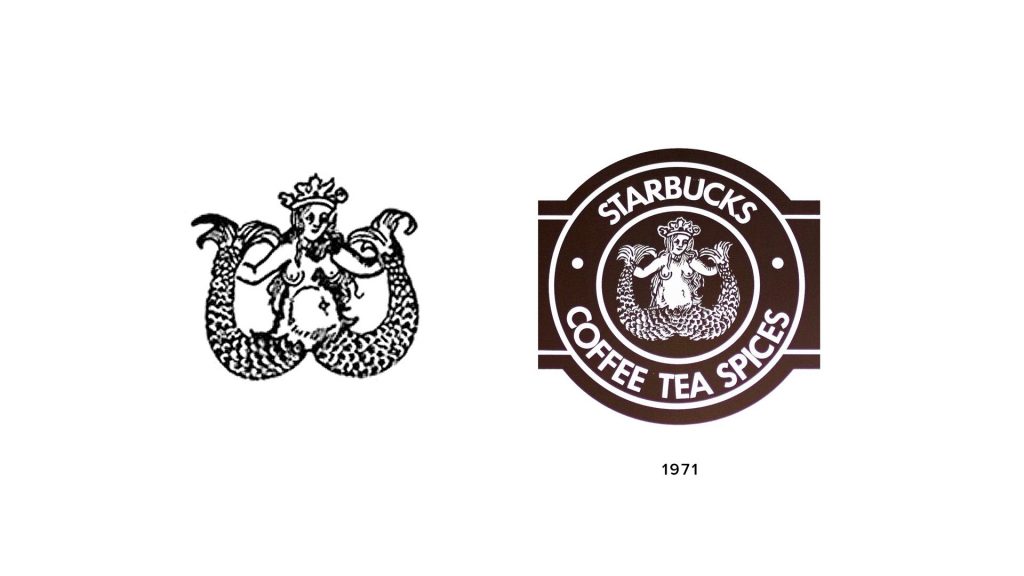
In 1971, the trio were inspired to get into the coffee business by Alfred Peet of Peet’s Coffee. Peet brought custom coffee roasting to the US and is widely credited for starting the specialty coffee revolution in the US. After teaching the young men everything they needed to know to run a successful coffee business, Starbucks was born. Starbucks was named after a Moby Dick character, so to keep with the maritime theme of the business that paid homage to its Seattle port origins, the Starbucks logo was to be the twin-tailed mermaid. A seductress to lure thirsty, coffee loving customers into the store.
In the early days, Starbucks only sold coffee beans for customers to take home. It wasn’t yet a place for customers to order drinks in store. The man responsible for this phenomenon is Howard Schultz. In 1982, the new director of marketing went on a buying trip to Milan and was so taken with Italian coffee culture that he wanted to bring it to America. He loved how people would congregate at coffee bars to socialise and saw an America where this was the norm. He presented the idea to the owners, but after the initial success of their business they were reluctant to mix things up too much. So Schultz left for a few years and started his own coffee shop, Il Giornale, before buying Starbucks in 1987.
One on every corner!
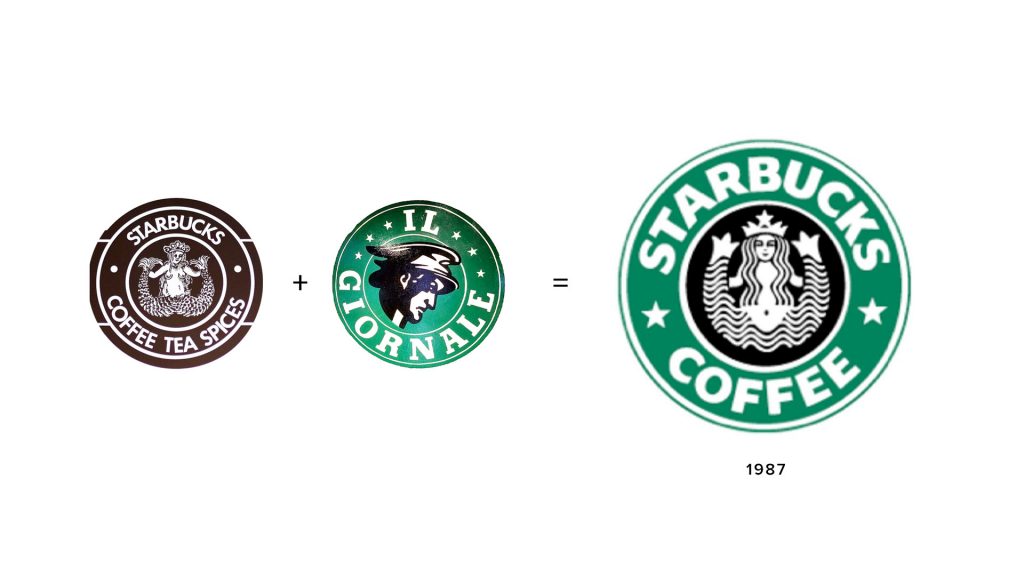
This is when it all changed. In 1987, Schultz was on a mission to rapidly expand Starbucks across America and bring the Italian coffee culture to the US. He changed the brands logo to a more simplified version; the mermaid was no longer lifelike, but more of a stencil-cut. ‘Tea’ and ‘Spices’ were removed from the sign to focus the business on coffee, and a green background was added to the outer ring. Two stars replaced the dots between ‘Starbucks’ and ‘Coffee’ to link the name with the mermaid by the star in her crown. With the mermaid’s black background representing the coffee beans and bringing the mermaid in white to full attention, the green was inspiration from Il Giornale’s logo and signified a fresh start for Starbucks.
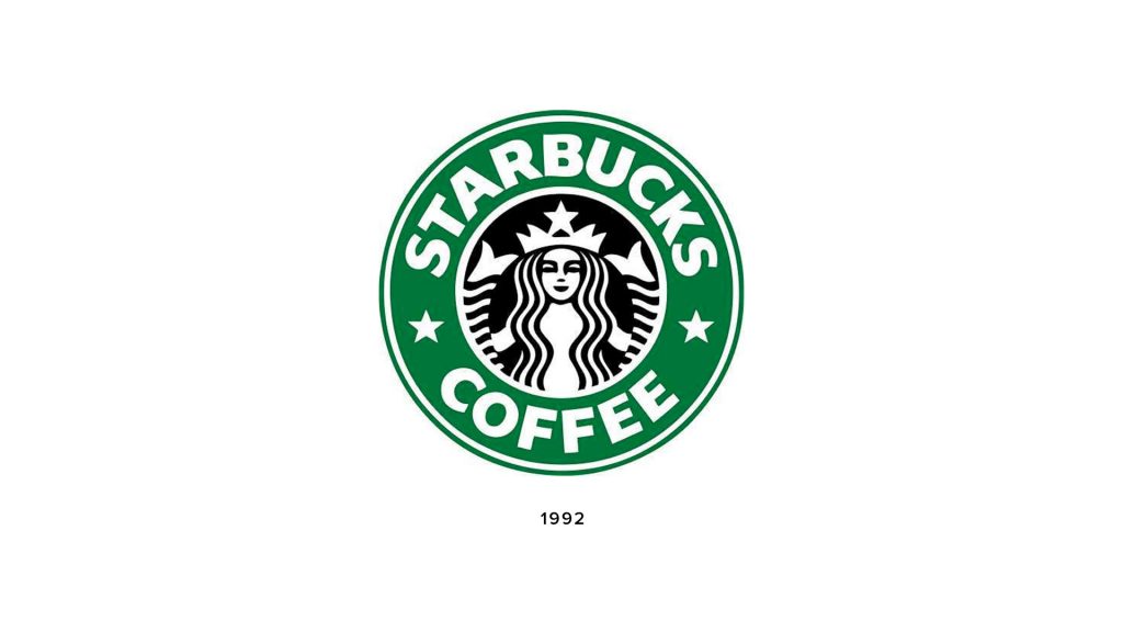
As business boomed, the logo became more and more well-known. In 1992, the logo was simplified further to bring the mermaid into greater focus. This is the logo that plastered white coffee cups around the world. This is the logo consumers were drawn to in foreign countries. A stamp of familiarity and the sign of a warm brew waiting. Starbucks had become the social hub, second office and home away from home that Schultz had hoped it would.
Fast forward to 2011, where Starbucks is the number 1 coffee house in the world, with over 17,000 stores worldwide. Everyone knew Starbucks and could easily describe the logo accurately. It had become a household name with a shop on every corner. So, approaching its 40th anniversary, it was time for another rebrand and this time it was the biggest rebrand yet. Enter, Lippincott, a design agency known for working with worldwide brands such as Marriott, Nissan and Samsung.
The Logo
Originally an emblem logo with a bold sans serif typeface in capital letters, the Starbucks logo is now simply a logomark. Whilst the text has been removed, the circular badge style shape has remained, with a greater focus on the mermaid and the negative space used to create her.
With Starbucks’ increased popularity and worldwide fame, the Lippincott team realised it was no longer necessary to drill the name ‘Starbucks’ into consumers’ heads. They already knew who Starbucks was and they knew that wherever they saw that seducing mermaid, there was perfectly brewed coffee waiting for them. The main problem with the name in the logo was that it limited how Starbucks was considered. The brand had aspirations to sell food and perhaps even wine at night. Starbucks wanted to start selling products in supermarkets and expand its offering. But with the name ‘COFFEE’ plastered on the logo, Starbucks would always simply be the place you go for coffee.
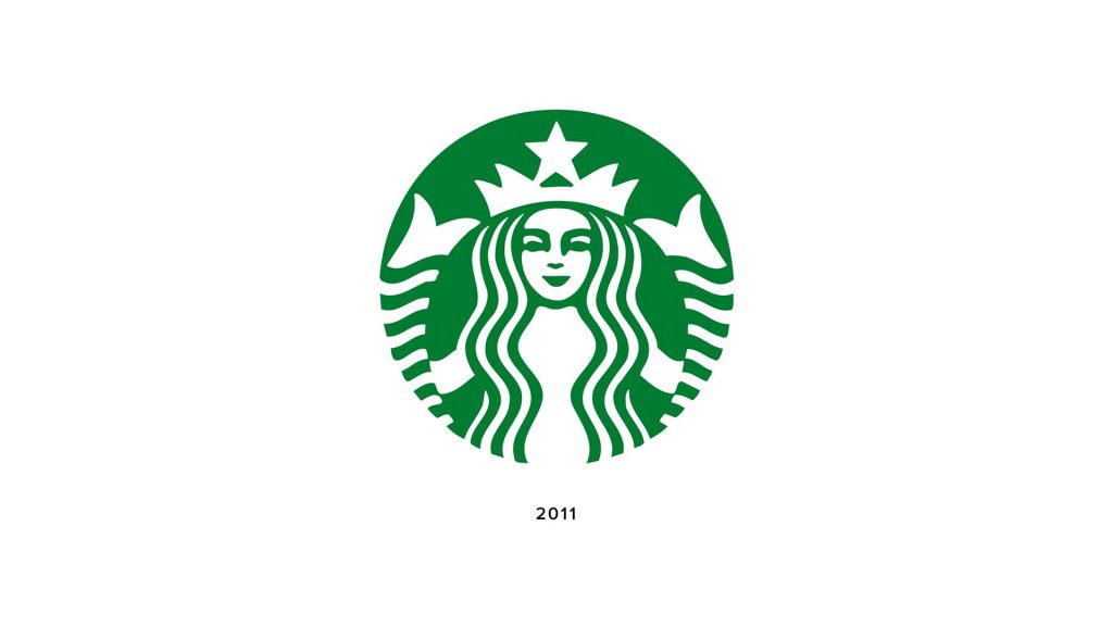
So, with the need for the Starbucks name no longer needed on the logo and their aspirations for products beyond coffee, the outer ring and all text within was scrapped. This rebrand completely removed text from the logo, thus opening the brand to greater product potential. The next step was to perfect the mermaid. She was the centre of attention and the one who consumers looked for when gasping for a cuppa. She had to be perfect!
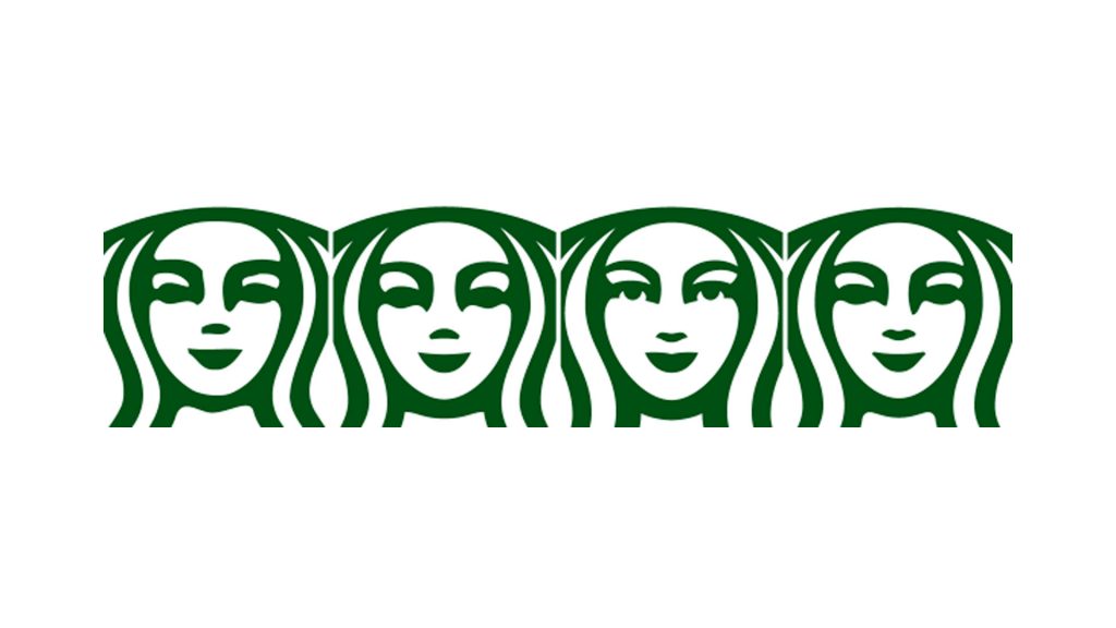
Perfecting the look
Lippincott began work on perfecting the mermaid and drew inspiration from the idea that human beauty is based on symmetry. They wanted her to be more human and more alluring, therefore she became symmetrical. But something wasn’t right… she didn’t look beautiful or human. Instead, she looked alien-like and a little creepy. After some thought, the Lippincott team realised that the secret wasn’t to make her beautifully perfect, but to make her imperfectly beautiful.
Source: Lippincott
That’s what makes her human; her imperfection. So some slight tweaks were made to make her face more asymmetrical. This resulted in the perfectly imperfect finished logo that adorns our coffee cups today. As the centrepiece of Starbucks, the beloved mermaid has worked as inspiration for the new full visual toolkit.
“Her wavy hair becomes a graphic pattern. The shapes in her crown adorn the credit card. And next time you open your Starbucks app, take note of the background. She’s an elusive symbol, but one that feels perpetually present.”
Lippincott
As an ever expanding brand with plans to embark on new ventures, the mermaid became a guide for the team at Lippincott. They wanted to maintain her distinctive presence across a variety of environments. The consistency of application of her patterns across packaging, marketing and environmental design maintains the distinctive feel of Starbucks throughout. The new logo has opened doors for Starbucks that the word ‘Coffee’ has previously kept closed.
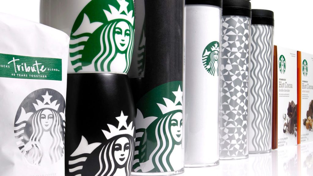
Source: Lippincott
What do I think of this logo?
This is an example that shows a logo can indeed be anything if there is a good story behind it. When we think of the top coffee high street brands such as Caffe Nero, Costa, The Coffee Bean & Tea Leaf, Jittery Joe’s and It’s a Grind to name a few, we see the use of coffee beans and cups in their logos. Starbucks is one of the only coffee brands that has an image that has nothing related to coffee, yet it’s one of the biggest.
Is their success based on their use of a mermaid instead of a coffee bean? Probably not, but it proves that it’s the success of the business that has given exposure and familiarity to the logo not the other way round.
The Starbucks logo is an icon today, but not necessarily based on its design. There will be great logos out there that may not get much exposure, yet with Starbucks having chains around the world, it’s an image that has become a household name and an icon as prominent as Coke and Apple, examples of logos that may not be design perfection, but icons representing successful business.
What can we learn?
When creating designs for logos, we don’t necessarily have to depict the product in a literal sense. If it can be captured in a subtle way, that’s a bonus. At the end of the day, a logo represents a company or product, and sometimes a mysterious symbol representing a story or ideas can be a good solution.
As designers, we are always looking for perfection, for that perfect balance and symmetry, yet it’s not always the key to the solution. We learned how Starbucks sought after that in their mermaid icon and realised that mystery and imperfection can be appropriate and more alluring.
The Starbucks logo is a perfect example of the correlation between exposure and awareness. The bold uniqueness of the mermaid design makes the logo easily recognisable all over the world. The increased exposure of the logo successfully associated good and reliable coffee with the Starbucks brand. It shows how simplicity and continuity can be welcoming and familiar, thus helping consumers remember and rely on a brand.
Remember, not all design is perfect. Sometimes the most perfect design for the brand has imperfections. And, after a certain point, words become unnecessary. If you can make your design distinctive against the competition in a way that allures customers, you may very well be on to a winning design.
See the full 2011 redesign on the Lippincott website here
Liked this Logo review? See more like this here
